Raising and lowering the volume on an iPhone

I’m an iPhone owner and I think it’s a pretty amazing device. It’s not perfect, of course, but I’m generally happy to live within the bounds of its constraints and take advantage of its strengths. Any device that breaks new ground, though, is bound to have its own idiosyncrasies. Here’s one on the iPhone that’s more amusing than annoying for me, but it does occasionally trip me up.

An iPhone in vertical orientation, showing controls

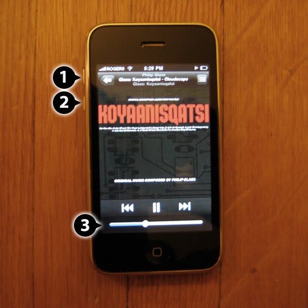
The iPhone includes a hardware-based volume control in the form of a pair of buttons. When viewed in vertical orientation, the buttons are at the top of the left edge of the device. Pressing the higher button (1) makes the volume go up, or higher. Pressing the lower button (2) makes the volume go down, or lower. So far, pretty straightforward. There’s a clear mapping between the buttons and their effect on the volume

There’s a little twist introduced when in the iPod app. There is also a volume control in the form of a slider on the touchscreen (3). Dragging the slider to the right raises the volume and dragging it to the left lowers the volume. Pressing the volume buttons will move the slider too. The slider is is oriented perpendicularly to the hardware buttons, but it works.

An iPhone in horizontal orientation, showing controls

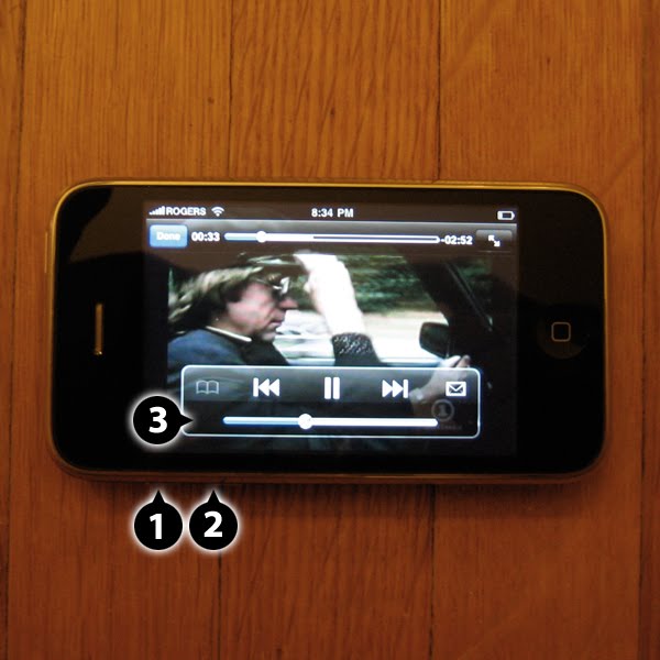
Things get more interesting when viewing the iPhone in horizontal orientation. The two hardware buttons are now at the left side of the bottom edge of the device. Pressing the left button (1) makes the volume go up, or higher. Pressing the right button (2) makes the volume go down, or lower.

Here’s where things get most interesting. In the YouTube app there is a volume slider (3) that is identical in functionality to the one in the iPod app. That is, dragging the slider to the right raises the volume and dragging it to the left lowers the volume. So far, so good. Pressing the volume buttons will still move the slider too, but with counter-intuitive results. Pressing the left button moved the slider to the right, raising the volume. Pressing the right button moved the slider to the left, lowering the volume.

One could make the case that the slider and the hardware controls are behaving consistently regardless of orientation, which is true. The trouble is that the consistent behaviour leads to an unexpected result when the iPhone is in horizontal orientation. In the end, though, it might not matter much, since it’s only a problem when the slider is visible on screen. The YouTube app usually hides the controls, and the hardware control obviously works without the slider being visible. Still, it’s an interesting quirk.

DemoCampGuelph11 coming up on Wednesday

The next DemoCampGuelph event is at 6:30pm on Wednesday September 30 at The Ebar in Guelph. As it says on the description:

Anyone in and around Guelph interested in software, the web and technology! Startup junkies, wage slaves, consultants, students, indie professionals, engineers, designers, money and marketing guys. If you want to see and talk about some interesting things, and get to know other people in the Guelph tech community, come on out! You don’t have to demo to attend.

Sound interesting? Of course it does! Get signed up and get to the Ebar. Beer and software demos make for an event that’s just too good to miss.

IDEA2009 is in the rear view mirror

A presenter on stage at the Idea09 conference

IDEA2009 has come and gone and I’ve been reflecting upon my experience there. The event was well-organized and in a fine location in downtown Toronto (MaRS). There was a diverse set of presentations over the two days of the conference; it was mix of good and very good, with useful information nuggets in all. Highlights for me included Leisa Reichelt’s story of working with the Drupal open source community, Matthew Milan’s Innovation Parkour, Stephen Anderson’s take on Seductive Interactions, Christina Wodtke’s tour of great design ideas, and Mari Luangrath’s engaging tale of how she grew her business using Twitter.

Happily, the slide decks for the presentations are being made available online. I need to trawl through the Twitter feeds to find them!

UX Group of Waterloo Region kicks off new season

A new season of UX Group of Waterloo Region fun starts this Thursday, September 17 at 5:30pm at the Accelerator Centre. This first event, inspired by Scott Berkun, will be a design interactionary, an evening of hands on design fun in which teams take solving on design challenges in a ridiculously short amount of time. It promises to be good fun, and it’s a great opportunity to get to know other designers in our community and get to work with them.

Check out the details, and note the RRSP. Sadly, I’ll have to miss this great event myself due to immovable commitments elsewhere.

IDEA09 is practically here!

Boy, sometimes stuff just sneaks up on me!

I’ll be going to the IDEA2009 conference in Toronto next week. I’ve been registered for a while, and it was always on my radar, but it just felt like it was off over the horizon. Now it’s here and IDEA2009 should be a great event. My friend and Primal Fusion colleague Bob Barlow-Busch will be driving up together and and we’re looking forward to a stimulating couple of days of conversations, presentations, and general interaction design goodness.

Kudos to the organizers for putting together such an interesting program.

Next BarCampWaterloo is this Saturday

The next edition of BarCampWaterloo is coming up on Saturday September 12 at the Accelerator Centre in Waterloo. It runs from 11:00am to 5:00pm. There aren’t a lot of details available online right now, but have a look at what there is, and then sign up here. Demos are always interesting, and the conversations ought to be as well; there may well be food and drink as well.

A metaphor several times removed

There have been reports, recently, that Apple will reveal a new focus on albums on iTunes sometime soon. This news got me thinking about the use of metaphor in designing a user experience.

There are a couple of kinds of ‘albums’ available to users of Apple products (Mac, iPod, iPhone). One is a photo album, which is a collection of photos. The metaphor makes sense, as a digital photo album has a strong association with its physical world counterpart, in which photos are kept in pages bound into an album.

Another is an album of songs, which is a collection of tunes typically assembled for purchase together. The most recent physical world counterpart of a digital album of tunes is probably an album in compact disc (CD) form, a convenient medium for selling music. The metaphor also makes sense, though compact disc really isn’t much like a photo album — why is it also called an album?

An LP and a CD of a Bruce Springsteen album (‘The Wild, The Innocent & The E Street Shuffle’)

Referring to a CD as an album is a continuation of the use of the word for a collection of songs on a Long Playing (LP) vinyl disc (initially in either 10″ or 12″ formats, later in predominantly 12″ format), an earlier medium for selling music. The fact that many CDs were reissues of earlier vinyl albums, as in Bruce Springsteen’s The Wild, The Innocent & The E-Street Shuffle, made the association an easy one. The thing is, many vinyl albums aren’t much more than a highly decorative (and often informative) cardboard sleeve with an internal paper sleeve containing a vinyl disc. That’s not much like a photo album either. Why is a vinyl record also called an album?

A book-like 78 RPM album of music by Saint Saens

Go back a little further, and you find the 78 rpm record medium that preceded vinyl albums. While a vinyl record could easily hold as much as 40 minutes of music, 78s were much more limited. Each 78 could hold only a few minutes of music, and was typically sold in a plain paper sleeve. 78s were sometimes sold as a group for longer pieces of music that couldn’t fit on a single disc, classical music pieces being a prime example. For such a group, the 78s were kept in paper sleeves bound into an album, as in this release of Symphony No. 3 in C Minor by Saint-Saëns. And that’s very much like a photo album.

A book-like 78 RPM album of music by Nat King Cole

It wasn’t a big leap to collect previously released songs into an album of 78s. Nat ‘King’ Cole was a hit maker whose music has been repackaged extensively over the years, going back to the 78 era.

A CD packgae that mimics a book-like album of 78 RPM records

Finally, here’s an example where the packaging of a product is deliberately evocative of an earlier form for reasons other than metaphor. Aladdin was a record label that released songs in the 78 rpm disc medium. A CD of reissues from a few years ago featured a package design that resembled an album of 78s.

I’m curious to see what Apple comes up with, if anything, to bring yet another variation to the music album.