Scary pumpkins at Karos Health

A desk covered with Jack o Lanterns

We had a fun end-of-day session at Karos on Wednesday this week, carving pumpkins into Jack-o’-lanterns in anticipation of this weekends’s Hallowe’en holiday. This was the first time that some our team had ever carved one before, which made the session special. We had children from some of the team come to the office, as well, to contribute their scary carvings. I managed to let my four-year-old work on his own carving without too much interference, and he did a great job without losing any of his fingers! As the photo shows, the results make for a fine display.

After the curb, where does our waste go?

An enourmous pile of cardboard at recyling facility

My family and I went for a tour of the Region of Waterloo’s Erb Street landfill site over the weekend. It’s the kind of thing that my sons and I usually enjoy doing, and this time my wife went as well.

There were many interesting sights and a lot to learn; I feel like I should have been taking notes! For example, the scale of waste management that goes on at the facility is eye-opening. We learned that while power generations isn’t the focus of the facility, methane that is produced by the waste is enough to fuel the on-site generation of electricity that is sufficient to power 4,000 homes.

A message that our guide repeated a few times is that the landfill site has a finite lifespan. Everything that we, as individuals and families, can do to divert waste from landfill helps lengthen that lifespan.

For me, though, nothing conveyed the scale of operations and the importance of diversion as much as seeing the bales of plastic or the mountain of corrugated cardboard that filled the building where processing of recyclable materials happens. The reason to reduce, reuse, and recycle becomes visibly obvious when seeing these sorted recyclables.

On a final note, we were delighted to replace our curb-side green bin while on the tour. Our old one has been in use for quite some time and has an impressive hole gnawed through it as a result of squirrels trying to get at the contents. Thanks to the Region for that, and for the opportunity to see the final destination of the stuff that we put out by the curb for collection every week.

Murphy was an optimist

I visited the Accelerator Centre this week to do a presentation/workshop for an MBET class at the University of Waterloo. The first part of the class turned out to be a bit of a challenge. Well, it was more than a bit of a challenge. It was a vivid manifestation of Murphy’s Law in action.

My presentation included supporting visuals prepared in Keynote, Apple’s wonderful presentation software for Macintosh. While I had brought my laptop, and everything else needed for the class, I had neglected to bring the correct video cable to connect my laptop to the projector in the classroom. No connector meant no supporting visuals.

Not a problem. There were other laptops in the room and there was a viable plan ‘B’ — all I had to do was export my Keynote presentation to a Powerpoint version, and transfer it to a Windows laptop. I had, in the past, done this translation many times. On this occasion, though, it didn’t work.

OK, then, on to plan ‘C’ — upload my presentation to slideshare.net. The conversion failed there, too.

Plan ‘D’ was the one that finally worked. A great colleague at Karos Health graciously hand-delivered the right cable after I called the office with my tale of woe. Cable in hand, I connected my laptop to the projector and jumped into my delayed presentation.

Of course, theres an inevitable punchline to this story. The presentation/workshop that I was delivering was about delivering presentations.

My primary design tool is a pencil

A close up of a mechanical pencil tip

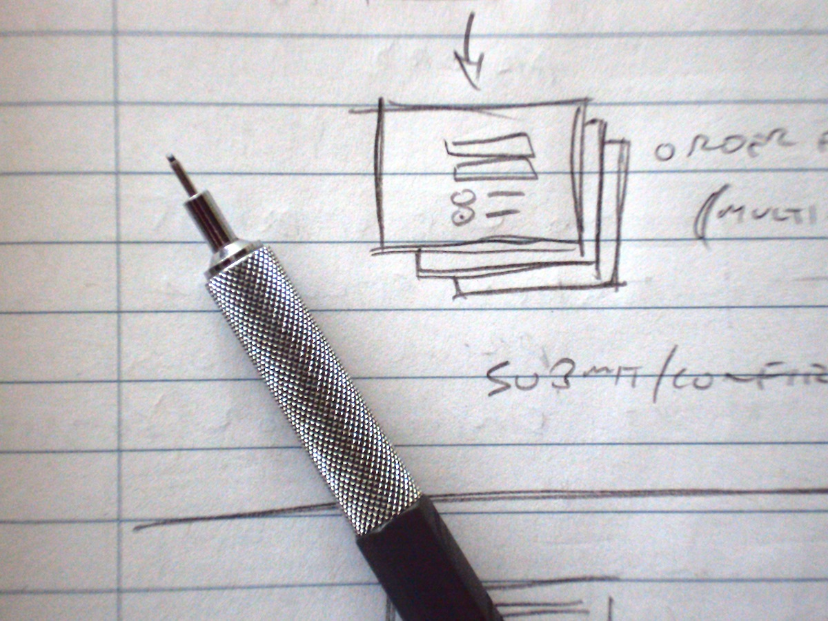
I sometimes have conversations with designers, and non-designers, about tools used in designing for user experience. While I’ve used many software tools over the years, such as the venerable Adobe Photoshop, some folks are mildly surprised to hear that my primary design tool, one that I use every day, is the decidedly humble pencil.

A pencil is simple, highly portable, reliable, and works well for a number of tasks. My main pencils are mechanical ones that takes .5mm leads. I’ve found that .3mm leads are too thin for my often-heavy hand and easily break. I also have a pencil that uses .7mm leads, but I don’t use it as much.

The primary, though not sole, design task that the pencil supports occurs early in the design process. Ideation involves a lot of generation, exploration, and development of ideas. The pencil is the tool that enables me to capture my visual thinking quickly. Whether used to create tiny thumbnail pictures of a screen’s overall layout, or for capturing more details on a form design, a pencil enables me to get the job done quickly. The drawings are often pretty rudimentary and ugly, but that’s fine for capturing my visual thinking for my own use. For sharing ideas I usually render the visuals in a more refined way.

A companion tool much of the time, particularly when at work, is a 7.5 inch by 9 inch notebook. Sometimes, though, I’ll switch to a larger pad of grid paper. When I’m away from the office or home, I use a smaller Moleskine notebook, which has a lovely tactile quality as well as paper that takes pencil marks quite well. Really, though, any small notebook would do.

In addition to my mechanical pencil, I also use wood-cased coloured pencils for various reasons and at various design stages. They’re a little messier, as they need periodic sharpening and the leads are more prone to breaking, but I like them. I’ll use colours to lightly shade areas in a pencil sketch to help me easily pick out major features at a glance, or use a heavier coloured line to call attention to a particular feature.

As an aside, one of my favourite books is The Pencil, by Henry Petroski. It’s a great read that explores the nature of engineering and product development via an engrossing story of the history of the pencil.

User Experience in Waterloo Region

This piece first appeared this week as a blog post on the newly launched Communitech web site.

We’ve kicked off a new season of uxWaterloo events last month with a design workshop. As it turns out, Communitech is launching a new web presence this month as well, which makes this an opportune time to write about designing for user experience (UX).

Many articles and books have been written on the topic of user experience, and there might not be a universally accepted definition of what it is. It’s reasonable to say, though, that designing for user experience in a software product will often address the following:

  • Functionality: what does the product do? Is it useful?
  • Interaction design: how does someone actually use the product?
  • Information architecture: how is the functionality in the product organized and presented?
  • Visual design: what does the product look like? Is it appealing?
  • Usability: how easy or hard is it to get something done with the product?

Getting these pieces in the UX puzzle right isn’t easy, but the results can have a major impact on a product’s success.

Waterloo Region is well-known for its innovative software and hardware companies, many of which devote dedicated resources to designing the user experience of their products. For some of the user experience researchers and practitioners who call the region home, getting together at a uxWaterloo meeting is a monthly activity.

uxWaterloo is, among other things, a Communitech peer-to-peer group devoted to building a community around the practice and understanding of creating a great user experience. While we’re primarily software-focused, we touch other areas on occasion as well. At our monthly meetings we explore a variety of topics through guest speakers, workshops, and even just discussion sessions at local pubs. In the last year we’ve explored table-top interfaces, guerilla usability techniques, personas in product design, and more. The atmosphere is friendly and folks are generous and willing to share their knowledge.

So here’s an invitation to all designers, product managers, developers, technical writers, and other interested folks to join us at a uxWaterloo meeting and help us to continue to grow our vibrant community around a common interest in user experience.

Can I quote you on that?

Since hearing Trevor Herrle-Braun speak at the Communitech Community Managers peer-to-peer group, I’ve been thinking a little about how I use Twitter for messaging.

Like many people, I exchange tweets with friends and colleagues, and occasionally with people whom I know only through Twitter. Being busy with other things tends to limit these interactions for me, though, which reduces my engagement compared with someone like Trevor.

I tweet about events that I attend, including regular events like uxWaterloo and DemoCampGuelph as well as one-off events like the talk by Google’s Alfred Spector last spring. (I also write at this blog about these things, as it turns out.)

One of the staples of my own tweets has been quotations that are, at least for me, inspiring or insightful. In large part that’s a result of my own reaction to seeing great quotes tweeted others. Jim Estill, whom I met while working at Primal Fusion, has been a steady source of such quotes and I’ve often re-tweeted his. John Maeda is another great source for me, with many of his best quotes being his own excellent aphorisms.

The last few weeks I’ve experimented with a higher volume of these quotes. Some of them get re-tweeted by others, so it feels like a worthwhile thing to do.

I discovered, though, that managing my collection of quotes in a text file was getting a little unwieldy. This past weekend I set up a prototype repository to manage the quotes more effectively. I had a few simple requirements. For example, I want to know which quotes I’ve tweeted and when I tweeted them. I also want my quote repository to automatically format my quotes for use with Twitter; I set it up to format my tweetable quotes using real opening and closing quotation marks (like “this” and not like ‘this’) and a tilde character (~) separating the quote from its author.

So far the prototype seems like a good tool and has met its modest goals. As I use it I’ll iterate on the design and implementation and make changes that reflect my usage patterns. Being a designer, that’s about what you’d expect me to do, right?