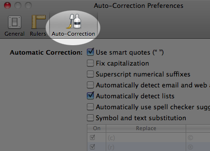
I’ve written before, and given an Ignite talk on, the use of metaphor in product design. I occasionally see an icon and wonder if it is recognizable as an object from the real world, and hence whether the metaphor is clear. Here’s an example from Pages, the document creation application that is part of Apple’s iWork product suite. The preferences dialog includes an area for specifying the behaviour of auto-correction of things like capitaliztion, quotation marks, and so on.

The odd thing to my mind is that the icon appears to be a bottle of correction fluid, something used to correct mistakes on documents created using a typewriter. As with using “cc” in email, the metaphor refers to a pretty old technology that is used by far fewer people today than it was in the past. Beyond that, it refers to a tool that is manual and pretty finicky, about as far as automatic as you can get. I wonder how many users of Pages in 2011 have never seen, let alone used, a bottle of correcting fluid? That is, for how many people is the icon unrecognizable and, hence, ineffective as a UI metaphor?
