
While traveling home from UX Camp Ottawa, Bob Barlow-Busch and I had a fun discussion about our airplane’s route as presented to us by the seat-back, enRoute system. The system cycles through multiple screens showing information about our trip in progress.
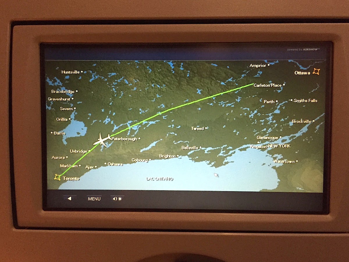
Here’s a photo of a route map, showing us flying west from Ottawa to Toronto. The airplane icon moves from right to left over the course of the trip. The map is presented at a variety of other scales as well. (As an aside, a segment of the route trace is missing at the start.)
Here’s a photo of what looks like a simplified route map. The airplane icon moves from left to right over the course of the trip. That’s the opposite direction to what is shown in the earlier map.
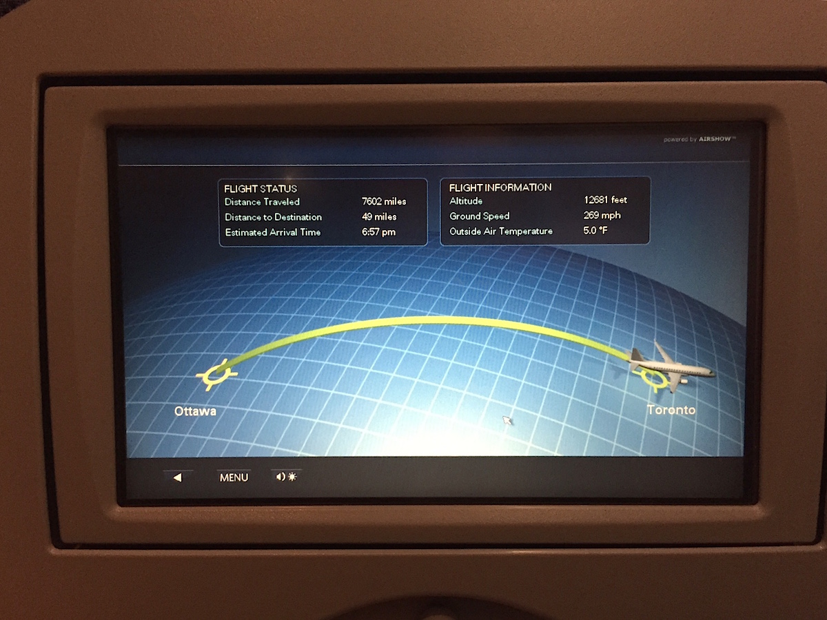
What’s going on is that the second map is really a progress indicator that has been “enhanced” through the addition of a curved grid and the use of a curved progress line. These enhancements seem to be meant to evoke a 3-dimensional route through the air. The problem is that when shown right after the previous map, the direction of travel is reversed for our particular trip. The system has a generalized approach to representing any given trip, and in the case of ours this conflicting presentation is the result.
A simple solution would be to create a progress indicator that is devoid of what Edward Tufte calls chartjunk. A clearer presentation would be unlikely to look like a flight trace.
Isn’t that fun?
As an aside, Bob and I were quite aware that we were flying through the air at high speed on a regularly scheduled flight, and that give that context this was a pretty minor issue for us!