The power of creating something that’s just good enough

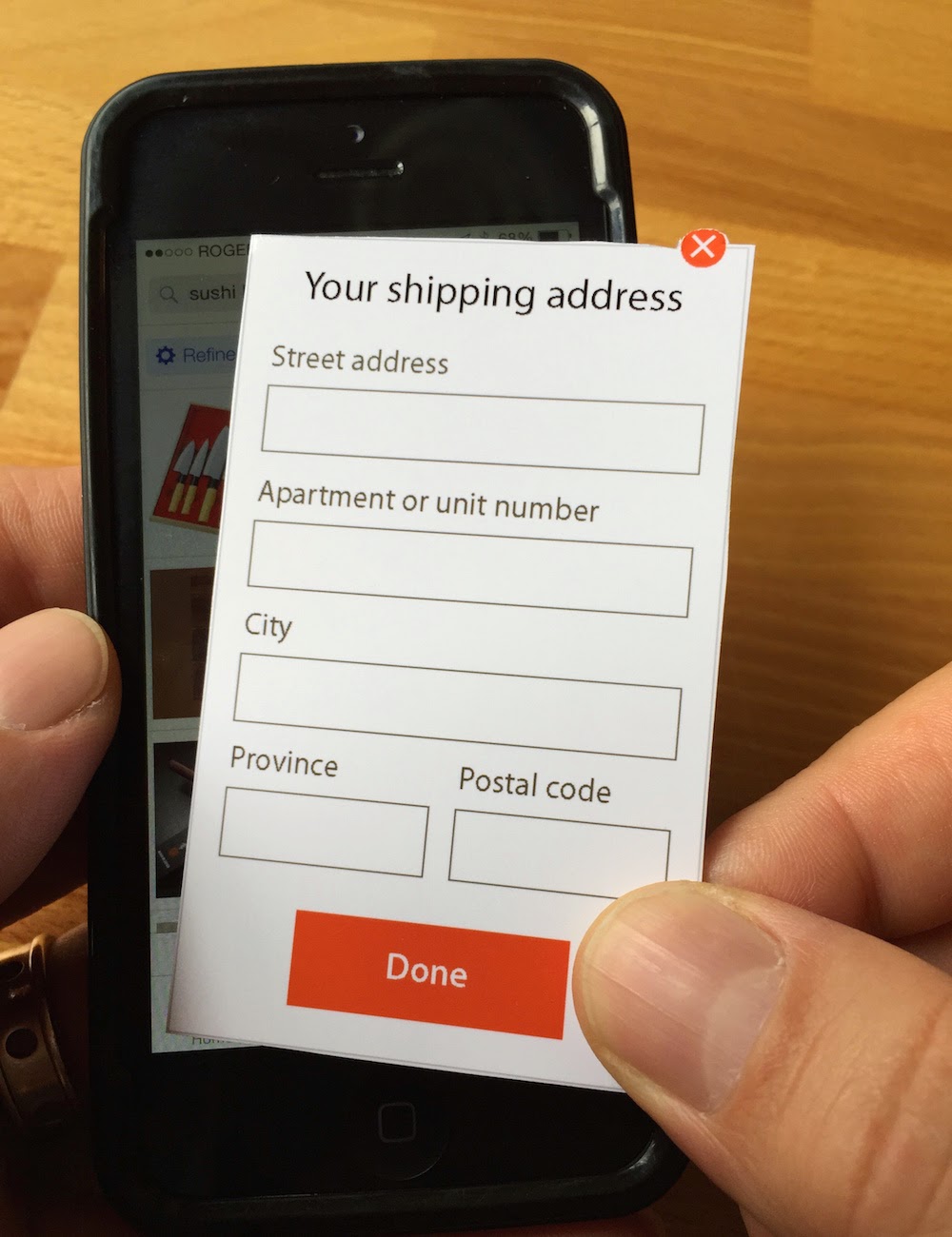
An iPhone with paper overlay for crafty screen manipulation

We had a fun day at Boltmade recently, engaging in a series of testing sessions with users to assess the usability of a product that we’re working on for a client.

We had made some extensive changes to a particular mobile workflow, and needed to create a testable artifact as quickly as possible. This scenario is well understood in the UX design world, and is pretty much par for the course when taking a Lean approach to creating a product. In this case there was a striking observation that emerged during testing that surprised us all.

The test artifact that we created used a mix of approaches: an existing product was used to show functionality that was already well-understood; paper screens were created to show new functionality; and a human simulated the product back-end by sending appropriate feedback messages through the existing product in response to user input.

We had a test rig set up that enabled some of the team to observe from another room while a user interacted with the new design on a mobile device. It was easy to watch progress on a large screen during each testing session and, as always, there were useful insights that emerged.

Every time the paper screen was overlaid on the mobile device by our test facilitator we chuckled, as it looked funny to see the paper slide into place on the big screen. None of the users, though, had any trouble with the switch from pixels to paper and back again. And the messages that were sent by one of our team to the mobile device created a smooth and easily understood experience.

But the most striking thing we saw only became obvious, even to us, at the end of the day.

Despite the test artifact being a mix of real and fake functionality that included pieces of paper overlaid on a device screen, it felt “real”. Each user was even asked to “enter” information onto the paper “screen”, and to then watch the response on the mobile device screen; it still felt “real”.

And it was “real” to such an extent that every user we tested with told us, either unprompted or when asked, that the messages they saw in the mobile app were coming from a system with some kind of clever A.I. behind it. The workflow provided such an immersive experience that even paper screens did nothing to break the illusion that we were testing with a “real” mobile app.

When testing a hypothesis in a Lean context, you don’t need to build a fully functional artifact. All you need is an artifact that is good enough to learn from during testing. And that can mean designing and prototyping before starting to build.

This post also appears over on the Boltmade blog.

Bypassing clarity with LinkedIn

LinkedIn is one of the most successful social media networks and, with its focus on career, it’s a valuable tool for many of us.

I’ve noticed that I receive many requests to connect that contain nothing more than the default message that LinkedIn provides. As a result, I’m not sure why the request has been made. Generally, that’s not a huge problem if it’s someone I know. When it’s someone I’ve never met and don’t know, though, it can make it hard for me to accept the request and I often don’t.

There’s at least one reason for those default requests that is addressable by LinkedIn. When accessed from some places, the workflow for making a connection request includes an opportunity for the requestor to include a custom message. It could be something like “Hey, great to see you at uxWaterloo last week. Let’s stay in touch about that Fluxible conference!”, which is actually pretty helpful for me. In other places, though, the workflow doesn’t provide that opportunity, which means that the default message is what appears in the request. This feels like a design gap to me. LinkedIn should ensure that it’s always an option for requestors to provide a custom message.

And if you’re using LinkedIn, take advantage of the opportunity to provide a little context and to explain why you want to connect!

Precise imperfection in the Yahoo Weather app

Screen image: Yahoo Weather app showing precise numbers

The Yahoo Weather app has been widely, and deservedly, praised as an example of a beautifully conceived and executed native app. I agree with those assessments, and use it on my iPhone most days to try to understand how many facets of Canada’s weather I might expect to experience in the coming hours and days.

There’s one detail, though, that stands out as gratingly wrong for me. It’s such a small detail that to point it our seems petty, but in an app that otherwise is of such high quality this tiny detail stands out.

While I can configure the app to use metric measurements for temperatures and wind speeds, it uses a mix of imperial and metric in the text summary of the forecast. The imperial measurements are shown first, with a precisely calculated metric equivalent shown in parentheses. In the example shown here, that makes for an awkwardly presented result of “High around 35ºF (1.7ºC)”. Wind speed presentation is similarly awkward.

The word “around” shouldn’t be followed by such a precise measurement. Beyond that, the text summary should just show me the metric measurements if that’s what I’ve configured.

On an unrelated note, I’m looking forward to seeing some warmer temperatures showing up in the app…