We’ll be right back after this short break

I’m sure that most of you reading this will have seen Google’s Gmail Motion announcement on April 1, or one or more of the company’s many other foolish initiatives on that day. I love that they play this stuff straight, and that some of the jokes can be pretty ephemeral (like showing search results for “Helvetica” on that day using the widely-disparaged type face Comic Sans).

There are also hidden bits of whimsy in Google products that have been a round for a while, but which still make me smile. The question in search results for “recursion” is a favourite of mine. And when I occasionally look in my Gmail spam folder for missing messages, the ads that link to recipes that use Hormal Spam® are always welcome.

A screen showing Gmail chat attempting to connect

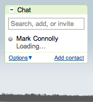
Sometimes the bits of whimsy are quite fleeting, but no less delightful when I notice them. I only recently discovered the messaging provided by Google’s chat functionality within Gmail. The company’s attention to details means that there are usually helpful status messages that explain what’s happening: “Loading…”

Screen image: Gmail connectivity state

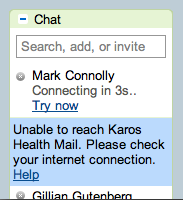
When there’s an interruption in service, Chat will try to reconnect. Again, a message provides details on what’s happening: “Unable to reach Karos Health. Please check your Internet connection.”

An were back

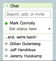
Of course, there’s also a message when the connection is restored. Evocative of a television talk show host announcing a return from a commercial break, the message “…and, we’re back!” is easy to miss, as it typically lasts only a few seconds. That means, though, that it’s also unobtrusive and it doesn’t get annoying. Lovely stuff!

Randomly generated assessment: Mark designs better

At Karos Health we’re always trying to improve the way we work. To that end, we recently enjoyed some Agile coaching from Declan Whelan. Declan is well-known in the Waterloo Region and beyond for his deep knowledge and passion for all things Agile, and his presence Karos was a welcome one.

During a presentation/workshop, Declan shared some of his findings into his review of our development practices. One of the artifacts that he showed was a tag cloud created using Wordle, and which was based on notes that he took during one-on-one discussions with the team. I’m big fan of Wordle, for both the insights that it can provide into a source text as well as the aesthetic appeal.

In the case of Declan’s Wordle, an unexpected juxtaposition of words was particularly delightful for me. The first image shows the original image that Declan showed. The second image highlights the randomly-created, found phrase that caught my eye. Sometimes, little discoveries are a lot of fun.

A Wordle with various words including design, team, and work

(Declan’s Wordle)

A Wordle highting the words ‘Mark Designs Better’

(“Mark designs better”)

Research Entrepreneurship Acceleration Project

I’m involved with a great initiative at the University of Waterloo. The Research Entrepreneurship Acceleration Project (REAP) brings creative academic and private sector experts to explore new technologies – especially those involving interactivity, responsiveness, and digital display environments – in order to spark “research entrepreneurship.” The program hires a small team of students each term to work on a project. REAP is currently looking for students for the Spring term. All the details are below. Please spread the word, or apply if you’re interested.

Research Job for Spring 2011
The Research Entrepreneurship Acceleration Project (REAP) is looking for part-time, extracurricular paid student positions for Spring 2011. We are looking for students who are:

  • Creative
  • Entrepreneurial-minded or interested in learning how to be
  • Group-oriented
  • Results-oriented

We need students with any combination of these technical skills:

  • Graphic design
  • Machimina and game engine design
  • 3D graphic rendering or animation
  • Kinnect-style interactivity design

Benefits include:

  • Designing cool content and applications for leading edge technologies
  • Learning business, project management, group, and presentation skills
  • Expanding your professional resume

For the Spring 2011 term, we will be designing a proof of concept for a ‘Virtual Whisper Room.’ A virtual whisper room uses a game engine to create virtual environment in which avatars of customers interact and play with early-state product/application ideas too expensive – or to difficult – to design and render in the real world. It would combine graphics, machinima, a Kinnect-style technology and MicroTiles (Christie Digital’s newest display technology). Its main purpose is to show rather than tell – to allow people to experience new ideas so that designers and entrepreneurs can gain invaluable feedback during the early stages of prototyping ideas for new products. In order to be considered please:

  • send your resume to reap.uw at gmail dot com by Monday April 5th 2011.
  • reserve Monday April 11th 2011 7–9pm for a mandatory info session. More details about this night after your resume is received and reviewed.

Autonomy, Mastery, and Purpose at Karos Health

I’ve written before about a book by Dan Pink called Drive: The Surprising Truth About What Motivates. I’m a big fan of the book, and the three simple things that Pink says matter to people who are working in creative positions, or positions that don’t just involve repeating the same kinds of tasks again and again.

  • Autonomy. Ideally, over what you do, when you do it, who you do it with, and how you do it.
  • Mastery. Your abilities are finite, but infinitely improvable; improvement demands effort; and mastery can never be fully attained, which is part of the allure.
  • Purpose. Within an organization, use profits to reach purpose, emphasize more than just self-interest, and allow people to pursue purpose on their own terms.

My experience at Karos Health has been one that delivers on all three.

  • We practice Scrum and other Agile product development techniques, which gives a lot of autonomy for team members.
  • We’re always looking for ways to improve on what we do and how we do it, both as a company and as individuals.
  • People find a sense of purpose in different places, but health care is an area that delivers on that for me.

We’re looking for people to join the Karos team and help build great products and a great company. Have a look at the positions that we currently have open and give some thought to how you might fit in. Feel free to get in touch with me directly if you want to learn more, or just send in an application. It’s a fun and rewarding place to work.

March roars in like a lion

Last week was a bit of a blur as March roared in with the usual commitments at work keeping me busy and several extra-curricular activities added to the mix.

Wednesday started with Communitech’s Tech Leadership conference, an annual event that provided a great opportunity to meet people and engage in conversations. It also featured a pretty impressive lineup of speakers. I have to confess that Geoffrey Moore’s keynote presentation was a slight disappointment; while he’s a dynamic speaker, the material didn’t seem to add much in the way of new insights to what he has previously published. This particular crowd has to have been pretty familiar with the concepts of crossing the chasm.

The next session for me was with Scott Berkun, whose talk on the Myths of Innovation picked up on the theme of his book of the same name. I’ve heard Scott speak before and knew that I would enjoy his talk, and I did just that.

Following Scott’s talk, I travelled with him and my uxWaterloo conspirator Bob Barlow-Busch out to Quarry Integrated Communications in St. Jacobs, where Scott had agreed to do a special uxWaterloo lunch time talk. The theme was creative thinking hacks, and the format was completely open and driven by questions from the audience. It’s the same format that Scott used when he last spoke to the group, and it works well.

Wednesday evening was spent at Design Exchange Waterloo, where I acted as an industry panelist along with a couple of members of the local design community, Graham Whiting and Tammy teWinkel. The event featured enlightening presentations and lively conversations with many students. The hardest part was deciding which teams to give awards to, but after much deliberation we were able to arrive at decisions. The next event will likely be in the fall, and I’m looking forward to it.

Thursday was, of course, TEDxWaterloo. I hadn’t planned on attending, but some last minute schedule changes and the timely appearance of tickets changed that. As with last year’s inaugural event, it was a day of stimulating and inspiring presentations from some distinguished speakers. It was all terrific, but the most delightful surprise for me was Ben Grossman’s presentation on the hurdy gurdy, an ancient musical instrument with which Ben made some striking music while he was on stage. Moreover, between the two sets of talks, Ben provided wonderful background music that, for me, enhanced the many conversations that I had.

Sprinkled throughout the week were a few meetings with some of my fellow Ignite Waterloo organizers as we make plans for our next event. More news on that later.

The lion and the trackpad

Apple has released a version of the next version of Mac OS X, code-named Lion, to developers. That’s a fairly standard step on the release road for the company’s OS updates. In an article at AppleInsider, though, I noticed this interesting tidbit:

The new multi-touch gestures are designed to take advantage of the larger click TrackPads on more recent MacBook models, which could make them more difficult with older notebooks. Another strange quirk, people familiar with the developer preview said, is two-finger scrolling is reversed: to scroll down on a webpage in Safari, users must push up with their fingers, which is the opposite of how it works in Snow Leopard, but the same directly as scrolling on the iPad.

I’m pretty sure that nobody at Apple, or AppleInsider for that matter, reads this blog. Anyone who has read my previous post on scrolling from March of last year, though, will know that the change doesn’t feel like a strange quirk to me. It feels like the right direction to go, and Apple is clearly addressing the collision between old and new interaction paradigms.

Design Exchange 2011

It’s been a busy month, with the most recent Ignite Waterloo event and planning for uxWaterloo keeping me busy outside of my day job. I haven’t done a blog post here in a while, and I thought I’d start to catch up by letting you know about an event that I’m peripherally involved with.

Design Exchange Waterloo 2011 is a student-organized, design-focused forum that’s happening from 6:00pm to 9:00pm on Wednesday March 2 in room 2218 of the Tatham Center at the University of Waterloo. The DXW website is currently light on detail, but I can share a little more information that I know about. The coolest thing about this forum is that includes ten groups of students from four different areas (Faculty of Arts, Faculty of Engineering, Faculty of Environment, and School of Computer Science) presenting their design work. There also will be ample opportunity to discuss design, incubate ideas, and connect with a diverse group of students and industry professionals through their shared interest in design.

To that end, the organizers are hoping to see people from the off-campus community join the students for what looks to be a lively event. I can say from my own past experience that it’s well worth attending. At the last event, back in 2009, I even met a student whom we subsequently hired as an intern at Primal Fusion, an outcome that may have been unusual but which was more than welcome all around.

Here’s a my understanding of the agenda for March 2:

  • Introductions
  • 5 student presentations
  • 30 minute snack break (mingle period)
  • 5 student presentations
  • Awards for Best Presentations, Most Innovative Design
  • Concluding Statements

Should be an interesting event.

A fifth Ignite Waterloo is coming

Logo: Ignite Waterloo

I’ve been involved in organizing Ignite Waterloo, which produces a series of events in Waterloo Region, since the first event in 2009, and it’s been amazing to watch the events grow in popularity since that inauguration of the series. We now easily attract well over 200 people to these things, and, as I was telling someone last week, we have relied pretty much on word of mouth and social media to spread the news about our activities. Of course, there’s much more hard work than that to get an event off the ground — and there are many people who make it happen — but it’s been a big hit with audiences and speakers alike with very little traditional communications.

The next Ignite Waterloo event is scheduled for Tuesday February 8 at the Communitech Hub in Kitchener, and even though we only announced the date and venue on January 11, we’re already pretty much sold out. Still, try to get a ticket if you want one and see if you can get lucky.

Adding albums to the music mix

LPs by John Cage and Bruce Springsteen

I spent some time over the holidays updating the music on my iPhone. That’s something that I do periodically, as it has far less capacity than would be required to hold my music collection and I like to vary what I listen to. The sources for the tracks are varied. Some I download from iTunes and other sources. I often digitize music that I have on CD. Less often, I digitize music that I have on vinyl albums or 45s, and doing so recently got me thinking about mix tapes.

I’ve created them, in the distant past, and enjoyed the reverence for the form in Nick Hornby’s High Fidelity (in both novel and film versions). Still, it had been many years since I made a mix tape, and even a few years since my last round of vinyl digitization. In the intervening time I had filtered from my memory just how out tedious it can be to digitize more than a few tracks. I retained only a fuzzily idealized notion of savouring each track while it is transferred to digital form (or, as I did in days gone by, cassette tape). That notion holds for the first few tracks, but the novelty does wear off! Here’s a simplified version of the steps required to digitize a track:

  • Connect the turntable to the computer.
  • Pull the record from it’s sleeve and put it on the turntable.
  • Start the turntable and drop the needle on the track; set recording levels to be loud but not so loud that distortion is introduced during the loudest passages.
  • Once levels are set, drop the needle again, but before the piece starts.
  • Start the digitizing/recording.
  • Enjoy the track while it plays.
  • When the track has finished, stop the digitizing/recording.
  • Remove the record from the turntable and replace it in its sleeve.
  • Edit the digitized track to eliminate any silence at the start and end of the track.
  • Add track to iTunes and add meta data to taste (Track name, Artist, sleeve art, etc.)
  • Repeat as necessary.

Obviously there are workflow optimizations available (e.g., record a batch of tracks, then edit them, then add meta data), but it’s still a laborious process. It was even more so in the past when the target was a cassette tape and the process included selecting tracks to efficiently fill a fixed length tape, manually minimizing silence between tracks, and creating cover artwork by hand.

Anyway, in the end I realized that I don’t at all miss the tedium of creating mix tapes the old-fashioned way, or digitizing analog formats. I do, though, love listening to the iPhone-age equivalent of mix tapes.

A bottle of correcting fluid as a metaphor

I’ve written before, and given an Ignite talk on, the use of metaphor in product design. I occasionally see an icon and wonder if it is recognizable as an object from the real world, and hence whether the metaphor is clear. Here’s an example from Pages, the document creation application that is part of Apple’s iWork product suite. The preferences dialog includes an area for specifying the behaviour of auto-correction of things like capitaliztion, quotation marks, and so on.

Screen image: icon of a correction fluid bottle

The odd thing to my mind is that the icon appears to be a bottle of correction fluid, something used to correct mistakes on documents created using a typewriter. As with using “cc” in email, the metaphor refers to a pretty old technology that is used by far fewer people today than it was in the past. Beyond that, it refers to a tool that is manual and pretty finicky, about as far as automatic as you can get. I wonder how many users of Pages in 2011 have never seen, let alone used, a bottle of correcting fluid? That is, for how many people is the icon unrecognizable and, hence, ineffective as a UI metaphor?