Adding albums to the music mix

LPs by John Cage and Bruce Springsteen

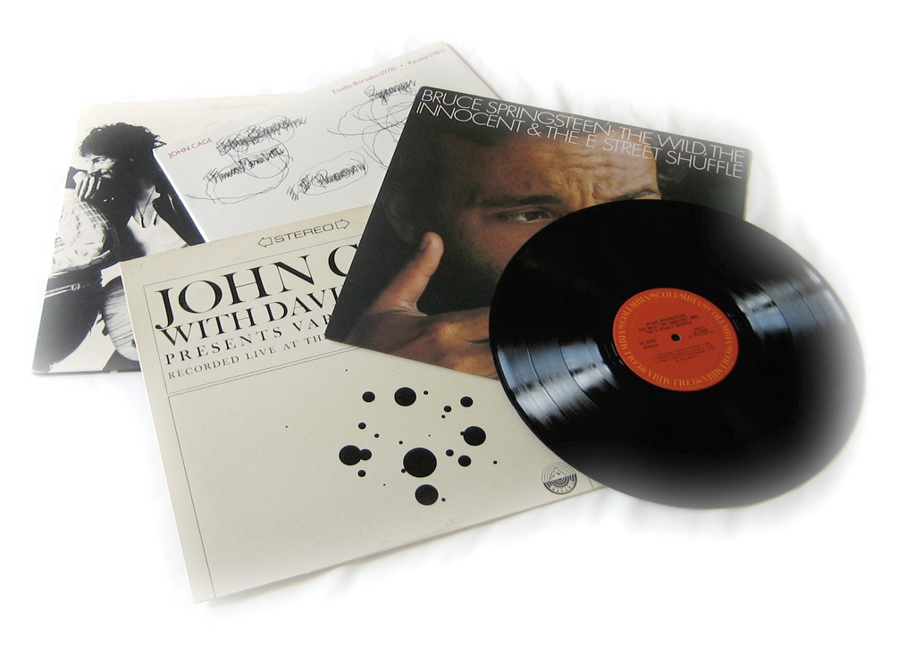
I spent some time over the holidays updating the music on my iPhone. That’s something that I do periodically, as it has far less capacity than would be required to hold my music collection and I like to vary what I listen to. The sources for the tracks are varied. Some I download from iTunes and other sources. I often digitize music that I have on CD. Less often, I digitize music that I have on vinyl albums or 45s, and doing so recently got me thinking about mix tapes.

I’ve created them, in the distant past, and enjoyed the reverence for the form in Nick Hornby’s High Fidelity (in both novel and film versions). Still, it had been many years since I made a mix tape, and even a few years since my last round of vinyl digitization. In the intervening time I had filtered from my memory just how out tedious it can be to digitize more than a few tracks. I retained only a fuzzily idealized notion of savouring each track while it is transferred to digital form (or, as I did in days gone by, cassette tape). That notion holds for the first few tracks, but the novelty does wear off! Here’s a simplified version of the steps required to digitize a track:

  • Connect the turntable to the computer.
  • Pull the record from it’s sleeve and put it on the turntable.
  • Start the turntable and drop the needle on the track; set recording levels to be loud but not so loud that distortion is introduced during the loudest passages.
  • Once levels are set, drop the needle again, but before the piece starts.
  • Start the digitizing/recording.
  • Enjoy the track while it plays.
  • When the track has finished, stop the digitizing/recording.
  • Remove the record from the turntable and replace it in its sleeve.
  • Edit the digitized track to eliminate any silence at the start and end of the track.
  • Add track to iTunes and add meta data to taste (Track name, Artist, sleeve art, etc.)
  • Repeat as necessary.

Obviously there are workflow optimizations available (e.g., record a batch of tracks, then edit them, then add meta data), but it’s still a laborious process. It was even more so in the past when the target was a cassette tape and the process included selecting tracks to efficiently fill a fixed length tape, manually minimizing silence between tracks, and creating cover artwork by hand.

Anyway, in the end I realized that I don’t at all miss the tedium of creating mix tapes the old-fashioned way, or digitizing analog formats. I do, though, love listening to the iPhone-age equivalent of mix tapes.

A bottle of correcting fluid as a metaphor

I’ve written before, and given an Ignite talk on, the use of metaphor in product design. I occasionally see an icon and wonder if it is recognizable as an object from the real world, and hence whether the metaphor is clear. Here’s an example from Pages, the document creation application that is part of Apple’s iWork product suite. The preferences dialog includes an area for specifying the behaviour of auto-correction of things like capitaliztion, quotation marks, and so on.

Screen image: icon of a correction fluid bottle

The odd thing to my mind is that the icon appears to be a bottle of correction fluid, something used to correct mistakes on documents created using a typewriter. As with using “cc” in email, the metaphor refers to a pretty old technology that is used by far fewer people today than it was in the past. Beyond that, it refers to a tool that is manual and pretty finicky, about as far as automatic as you can get. I wonder how many users of Pages in 2011 have never seen, let alone used, a bottle of correcting fluid? That is, for how many people is the icon unrecognizable and, hence, ineffective as a UI metaphor?

Usability of passwords

Like many people, I have a large collection of online accounts to manage. Examples for me include various email accounts, Twitter, and this blog. My large collection means that I have many passwords to manage. I like to think that I create passwords that are reasonably secure as well as being memorable for me, but its an annoyance to do so on a large scale.

Despite their many drawbacks passwords are currently a pervasive part of online life. While it’s easy for some to mock users for using unsafe passwords, a more nuanced approach is to understand that people are quite adept at circumventing security that gets in the way of their goals. Donald Norman has written eloquently about the challenge of designing a usable product with security in mind.

Some of the usability challenges around managing passwords were reiterated for me when I recently updated the passwords associated with my various online accounts. By sweeping through all my accounts at once, I got a concentrated look at various design solutions used by service providers to support password management by their users. The results were decidedly mixed in terms of usability. This message on restrictions in creating a password wasn’t unusual:

When changing your password, please remember that it must be between 5 and 8 characters in length and should contain both letters and numbers. Special characters (e.g. #, &, @) must not be used as they will not be accepted by the system. Passwords consisting of all letters or all numbers are not recommended.

While the message is clear, the underlying restrictions make it hard to come up with a secure, yet memorable, password. (As an aside, I’ll add that while I have my own strategies for creating and using passwords, I’m not going to describe them here. I hope the reasons are obvious!)

There are approaches to password creation that improve things a little.

One popular UI widget provides immediate inline feedback on the strength of a password that a user has defined for an account. I found several examples during my recent updates. Here’s one in particular that shows the feedback when I type in a terribly weak password for the account.

Screen image: ‘unsafe password’ warning

Not bad. The wording isn’t optimal but “Unsafe password” gets the job done. Here’s what appears when I provide a more secure password that includes a mix of letters, numbers, and special characters:

A screen showing feedback for a safe password

Again, the wording isn’t optimal but “Very strong” is fairly clear and also reassuring. Of course, the feedback is only useful when the guidance that it provides can be acted upon. Here’s what I see after trying to save the new password:

An error screen for a password that is too long

It turns out that my “very strong” password choice is too strong for this service!

Obviously, security is far from an easy problem to solve, and no single solution fits all needs. Having said that, this particular example from just one small sliver of a secure system is clearly bad design from a user experience perspective. The initial feedback is accurate in its assessment of the security of my desired password, but it’s irrelevant because the system won’t accept the password. The later feedback comes at a point in the workflow where it’s more frustrating than informative.

If passwords have to be a part of a product or service, design for them in a way that doesn’t needlessly decrease usability.

Developing with gingerbread at Karos Health

Constructing a gingerbread house

No, not the new Android release.

Yesterday at Karos Health we spent time building something special and appropriate to the holiday season. We built several gingerbread houses. Happily, though we were inexperienced builders, we were able to bring in some expert consultants to help us get the job done. The children of various team members came to the office and actually did pretty much all of the heavy lifting in building the candy-encrusted homes. It was fun to watch, and I know my boys had a great time.

Here’s a big thanks to Gillian for organizing this.

Conference strategy at Karos Health

The Karos Health kiosk at RSNA

I recently spent a week in Chicago at the annual conference put on by the Radiological Society of North America. I was there along with Rick, Michel, and Jeff, three of my colleagues from Karos Health (that’s Jeff in the picture). While it was my first visit to this conference, the others had all made the trip multiple times over the years. We had a great strategy for getting the most out of our visit, and I thought I’d share it here.

We had a minimal presence on the show floor, with just a tiny display as part of a booth organized by the Government of Ontario’s Ministry of Economic Development and Trade. It was perfect for us, though, as our strategy revolved around pre-arranged meetings and visits to specific companies rather than simply waiting for visitors to find us. Our display served as a place where people could find us if needed, with someone always present and ready to talk about our products and demonstrate our latest product, Rialto Consult.

We were able to provide demonstrations for a range of visitors. Some were people my colleagues knew who wanted to see our new product, some were existing customers, and some were new contacts that we made at the show. All were attentive while we showed what Rialto Consult can do and positive in their feedback. In fact, we were a little taken aback at the reception; we were pleased with what we were showing, but the response was even more than we could have hoped for.

There were a couple of highlights for me. One was prompted by a data issue, in which a customer noted that a sample document was missing from what we showed. I was able to add the document that evening, and when the customer returned the next day with some colleagues, the presence of the document did not go unnoticed.

The second was a visit to our booth by a colleague from one of our Karos Innovation Centers, who arrived while a demonstration was in progress. After we completed the demonstration, our colleague was able to answer some questions from the small audience relating to our work together. The timing was perfect!

RSNA 2010 was a successful conference with much positive feedback and a great response to Rialto Consult. In fact, on our return to Waterloo Rick characterized it as perhaps the most satisfying RSNA conference that he had attended. We’ll be there again next year.

This post originally ran, in a slightly different form, on the Karos Health blog.

Designing the BlackBerry user experience at RIM

Joey Benedek presnts at uxWaterloo

Following our November 16 event with Google’s Adam Baker, the November 24 meeting of uxWaterloo featured a terrific presentation by Joey Benedek, Director of User Research at Research in Motion, on designing for user experience at the mobile pioneer.

Joey focused on examples from BlackBerry OS 6 in a presentation that was funny, frank, and insightful in its examination of the challenges that RIM faced in this major upgrade to the user interface of its iconic products.

Joey gave some specific examples of how user experience techniques were applied to specific design challenges. For example, a diary study, in which user participants kept a diary and recorded how they worked with BlackBerry, was used to inform the design of universal search in OS 6. Card sorting, another classic technique, was used to understand how to organize the configuration of options in OS 6.

He was pretty direct about the need to deliver a major improvement in the BlackBerry user experience in a short amount of time — the overhaul was accomplished in just nine months. He was also pretty direct about the company’s logic-driven culture, and how an understanding of, and level of comfort with, the UX organization’s process and data helped make the case for what needed to be done.

Joey provided some great observations that may challenge the perception of RIM in some quarters. As Joey put it in response to a question, “There’s no confusion on our part about whether people are enterprise users or consumers. They’re all humans.” Later, he added “We don’t pick users. We pick contexts of use,” and “I’m a fan of the classic usability test”.

Overall, it was a treat to hear from Joey, and we all appreciated his presence at uxWaterloo.

Julie Rutherford has provided a more detailed summary over at the uxWaterloo site.

Designing for everyone at Google

Groups of people at tables working on a design exercise

As expected, it’s been a busy month. As a result I’ve let some obvious blog posts slip. Time to catch up!

Last week’s uxWaterloo meeting was a particularly interesting one, as it featured a design workshop facilitated by Adam Baker, a user experience designer at Google.

Adam divided the large crowd (over 70) into groups of four and gave each group a design to complete as well as a constraint. It turns out that there were only two designs being worked on amongst the groups, though there were several constraints.

After a short period of design activity, Adam directed that pairs of groups merge. At this point we discovered that half the groups were designing a user interface for specifying a pizza to buy, while half were designing a user interface for specifying delivery instructions. We now had groups of eight, and needed to integrate our designs for pizza and delivery UIs into a whole design. We also had to handle new constraints, as each former group of four brought one to the new group of eight.

After another short period of design, the groups were merged again, resulting in larger groups of 16 or so, and a larger group of constraints in each group. The larger groups engaged in a final period of design work, after which each group shared their results with the larger meeting crowd. At this point it became clear that the constraints were quite varied: design for someone just like you; design for iPad; design for an old BlackBerry for use on a train; design for 9-year olds; design for blind; design for first-time users; design for 100 pizzas delivered to 100 locations, etc.

The exercise was a practical demonstration of some of the challenges for user experience at Google, where designing for everyone (many millions) carries with it many specific and even opposing requirements.

Adam followed up with a fine presentation in which he identified some of the design considerations that are important when designing for search at Google. He likened it to travel in the “back country”, where a premium is placed on solutions that are lightweight, field-repairable, multi-purpose, few frills (are fast), degrade well, and are adaptable.

Famously, Google places an emphasis on measurement, which informs design rather than dictating it. Amongst the kinds of questions they ask, and look to measurements for answers, are “How long…”, “How many…”, “How ofter…”, and “When…”. Nothing earth-shaking there, but the rigour with which they approach measurement is striking.

All in all, it was a highly successful night, and there may be similar uxWaterloo events in the future. Stay tuned.

A busy calendar for November

November features a full slate of local events that I’m looking forward to.

StartupCampWaterloo is, at this point, well-known in the technology community. I’ve always enjoyed attending the events, and have presented there in the past as well. At the tenth edition on Nov 10, Rick Stroobosscher and I will be talking about, and showing, what Karos Health is doing. As an aside, this is right in the middle of Entrepreneur Week, a yearly “innovation festival dedicated to entrepreneurial spirit”.

I’m particularly close to a couple of organizations that have three fine events coming up, and I’m going into carnival barker mode here!

uxWaterloo has not one, but two, events this month. The first, on November 16, is Lessons from designing at Google, a workshop presented by Adam Baker, a user interface designer at Google. Closer to home, we’re excited to have Joey Benedek speaking on November 24 about User Experience at Research in Motion. Both these visits have been in planning for some time, and we’re happy that the stars aligned to bring these exceptional speakers to the group. Register soon, as these have become two popular events.

Another group that I help organize is Ignite Waterloo. We’re putting on a fourth event on November 18. and are pretty excited about the talks that we have lined up. Be sure to get your tickets if you haven’t already, as tickets are moving fast.

Somewhat farther afield, in Guelph, the fifteenth edition of DemoCampGuelph is happening on November 17. It’s always a good time, as past posts here should indicate. Happily, I’ll be just sitting back and enjoying the talk and beer at this one!

Plenty to do!

Marshmallows at Karos Health

A closeup of hands working with dried spaghetti and tape

Several weeks back I reported on the results of running two editions of the Marshmallow Challenge. Yesterday I tried it out with my colleagues at Karos Health. Three teams completed three towers — a 100% completion rate, a higher rate than at the previous two events that I wrote about. It was good fun, though after facilitating three of these events it would be fun to build something as well.

A visit to a Karos Innovation Center in Boston

I visited Boston last week along with Karos Health’s Rick Stroobosscher to meet with our partners in the Department of Radiology at Brigham and Women’s Hospital, a recently announced Karos Innovation Center. We’ve been working closely with the team there on a project, and the time had come for an on-site visit.

In addition to very productive meetings, I was able spend time with some of the department’s radiologists during an overnight shift in the Brigham emergency department. It was an eye-opening experience to observe how they do their jobs. Their knowledge, skill, and dedication in providing timely readings of the imaging studies that came to them was striking. Beyond that, knowing that there were real medical emergencies being handled with such calm expertise was quite humbling. I also appreciated the team’s gracious accommodation of my presence and their interest in the work that Karos is doing.

I’ve written previously about the sense of purpose that working at Karos provides. Seeing the radiologists at work brought that purpose to life in an unambiguous way. I’m excited by what we’re doing and looking forward to a long and fruitful partnership with the Brigham team.