Running a design sprint to increase project clarity and organizational capacity

Five people looking at and working with paper mounted on a glass wall

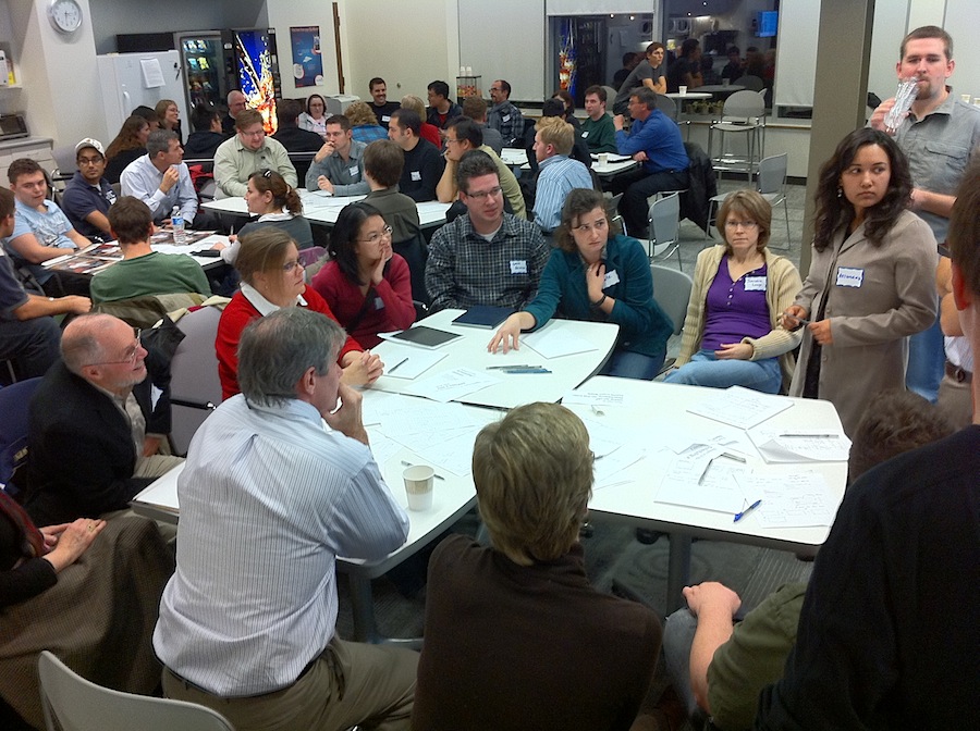
I recently ran a design sprint for Capacity Canada, an organization based here in Waterloo Region that helps charities and other not-for-profit organizations get better at governing and otherwise running themseves. In other words, they increase the capacity of these organizations to do good work. The design sprint that I ran was aimed at a new initiative that they are exploring, which is still in its early stages. My friend Matthew Reynolds introduced me to the initiative and to Cathy Brothers of Capacity Canada, and I was delighted to be able to help them move it forward.

As a designer, I’m pretty familiar with both the constituent parts of a design sprint, as well as the overall shape and framework that Google Ventures has refined and promoted with such success. And I had taken a workshop at Google last fall that teaches their own take on the GV design sprint. (The big difference is that they take a more flexible approach in terms of scheduling and duration of sprints.) And, of course, design for user experience is pretty core to what we do at Zeitspace.

We ran the five stages of this particular sprint in three days, and the sprint team’s efforts were pretty effective at generating results. Having said that, you have to have faith in the process to know that the uncertainty and confusion that appear early on will be resolved by the end of the sprint, with answers and insights that help move the project forward! Do check out Matthew’s take on the sprint, as I’ll forego going into too many details here.

It felt good to help clarify some options and otherwise help Capacity Canada via this design sprint. We’ll see where the project goes now.

Speaking of design sprints, I’ll be running a day-long design sprint workshop for the folks at Communitech as a part of their 2017 Tech Leadership Conference. If you’re at all interested in learning more, do check it out.

This post originally appeared on the Zeitspace blog.

Travel game with Google Street View

During my recent Karos Health trip to Chicago for RSNA, I accidentally discovered a fun game to play using my iPhone and Google Street View. On this and previous trips I’ve emailed photos to my son to show him some of the sights that I see. Often the pictures are taken while traveling from one location to another.

On this Chicago trip, my son noted in an email that one of the pictures I sent was similar to one that I had sent him during last year’s trip. I responded that it was probably the exact same view, as I would have taken both pictures while riding a bus between our hotel and the conference site. The next day he sent me an email showing me that he had found a similar picture on Google Street View.

Buildings in downtown Chicago

(My Picture)

A Google view of Chicago

(Street View Picture)

And thus, a new (for us, anyway) game was born.

Every day for the remainder of the trip I sent him a new photo, and he found corresponding shots in Street View for all of them. At first, I included clues in my emails, but eventually stopped and just let him discover clues in the the photos themselves. He didn’t have any trouble.

A view of Chicago

(My Picture)

A view of Chicago

(Street View Picture)

This turned out to be something that makes a business trip more interesting for my family. We might even continue the game here in Waterloo.

A new post, written on an iPad

For some time now, Google has been in the midst of a major refresh and consolidation of the design (and implementation) of its products. As of Wednesday this week, that design work has now extended to Blogger, the platform that I happen to use for this blog. At first glance, the new Blogger looks and works great. One major benefit of the revamp is that I can now write and edit posts on my iPad. That wasn’t possible on the previous version — or, at least, I wasn’t able to do so. The update doesn’t appear to be optimized for mobile — in fact, it’s a little flakey — but it does work. Maybe there’s more to come?

This post is about about little more than creating a test post on my iPad, while also taking the opportunity to express my admiration for what they’ve been releasing these past months. Google+ has been getting the bulk of the attention, but there’s great work being done on their other products as well.

Designing for everyone at Google

Groups of people at tables working on a design exercise

As expected, it’s been a busy month. As a result I’ve let some obvious blog posts slip. Time to catch up!

Last week’s uxWaterloo meeting was a particularly interesting one, as it featured a design workshop facilitated by Adam Baker, a user experience designer at Google.

Adam divided the large crowd (over 70) into groups of four and gave each group a design to complete as well as a constraint. It turns out that there were only two designs being worked on amongst the groups, though there were several constraints.

After a short period of design activity, Adam directed that pairs of groups merge. At this point we discovered that half the groups were designing a user interface for specifying a pizza to buy, while half were designing a user interface for specifying delivery instructions. We now had groups of eight, and needed to integrate our designs for pizza and delivery UIs into a whole design. We also had to handle new constraints, as each former group of four brought one to the new group of eight.

After another short period of design, the groups were merged again, resulting in larger groups of 16 or so, and a larger group of constraints in each group. The larger groups engaged in a final period of design work, after which each group shared their results with the larger meeting crowd. At this point it became clear that the constraints were quite varied: design for someone just like you; design for iPad; design for an old BlackBerry for use on a train; design for 9-year olds; design for blind; design for first-time users; design for 100 pizzas delivered to 100 locations, etc.

The exercise was a practical demonstration of some of the challenges for user experience at Google, where designing for everyone (many millions) carries with it many specific and even opposing requirements.

Adam followed up with a fine presentation in which he identified some of the design considerations that are important when designing for search at Google. He likened it to travel in the “back country”, where a premium is placed on solutions that are lightweight, field-repairable, multi-purpose, few frills (are fast), degrade well, and are adaptable.

Famously, Google places an emphasis on measurement, which informs design rather than dictating it. Amongst the kinds of questions they ask, and look to measurements for answers, are “How long…”, “How many…”, “How ofter…”, and “When…”. Nothing earth-shaking there, but the rigour with which they approach measurement is striking.

All in all, it was a highly successful night, and there may be similar uxWaterloo events in the future. Stay tuned.

Sometimes faster is indeed better

One of the important factors in a good user experience in a software product is performance (or, more accurately, the user’s perception of performance). That is, how responsive to user input does the product appear to be?

I’ve been thinking about performance since my switch from using Firefox to using Google Chrome as my primary web browser. Safari remains my secondary browser. I still use Firefox on occasion for a few specific tasks.

The first time that I used Chrome, I was struck by how much snappier it seemed to be compared with Firefox. There are probably more than a few technical factors that feed into that perception, along with important goals that the Chrome team set out to meet. As an aside, it’s well worth talking the time to read the comic book created by Scott McLeod in 2008 to explain Chrome.

Interestingly, once I had grown accustomed to my newly peppy browsing experience, I started to notice specific points of slowness. A big culprit was when the browser consulted a name server (part of the domain name system, or DNS) to find the location of a given web resource. I had always known that this was a bottleneck, but it really stood out now. DNS is typically handled by your internet service provider, but there are alternative DNS sources available. Hoping to address DNS slowness, I decided to try Google Public DNS, which launched late last year.

Lookups became far quicker to resolve — in all my browsers, not just Chrome — though slower sites are now more obvious than before, as resolving the domain name is dealt with right away (Twitter comes to mind in that regard).

I’m a big fan of Google. What strikes me here is the lengths to which they have gone to improve the user experience for their products by attacking performance in a big way. In addition to the work that they have done directly on their existing products (such as Search, Gmail, and Reader), they went far further and created a new browser and a new DNS product to speed up the performance of the web for all their users. In this case, where the performance gains are real and measurable, reality is also perception.

Sipping from the data hose

I’ve been wondering what it means to have access to vast amounts of data and information. In particular, I’ve been thinking about the implications, from a user experience perspective, when users assume that data is accurate and synchronized.

Google Maps recently added Street View coverage for Waterloo, Ontario, where I live. As many other people did, I spent some time exploring my city, and there were some interesting revelations. For example, I noticed that pictures of my own house probably came from two different days, based on stuff visible in our yard. Moreover, I was able to pin down one of the days to about three specific dates last spring, based on the apparent weather and on the presence of a car belonging to my brother, who visited from out of town. Fun discoveries!

I also noticed that there’s a mismatch between the street view imagery and the aerial/satellite photo imagery. I’m sure that many other people have noticed this before in other cities, and that it’s not particularly exciting news, but sometimes an issue needs to hit close to home (figuratively and literally) to get my attention.

Screen image: Google Streetview in Waterloo

Here’s a simple example. On King Street, there was some new development work done several years ago. The aerial/satellite imagery in Google Maps shows work in progress. Street View imagery shows completed buildings.

(See this example on Google Maps, though depending on when you access this link the imagery for the aerial view, the street view, or both may have been updated. The image shown on the right preserves the mismatch that I’m writing about.)

A mismatch like this is pretty easy to spot. It’s much bigger than one I alluded to regarding my house, which really only I might notice. What does it mean, though, when a business on a street view image closes and is replaced by another? What does it mean when users add their own photos? How does the addition of historical imagery (in Google Earth at this point) contribute to the mix? Does the fact that the Street View images are taken at different times matter at all?

In short, as more and more data is added to Google Maps, how do such data synchronization issues affect the user experience? I know that I find myself making implicit assumptions about the underlying data (for example, that the it is relatively synchronized chronologically), in part because I find the experience so immersive.

I’m sure that this isn’t an issue specific to Google Maps by any stretch. It’s just visible there, which got me thinking about what it might mean; I’m not yet sure what all the implications are!

Alpha beta soup, summer edition

Back in March I wrote about a major milestone at Primal Fusion. We went public with our first product and put out an alpha release for people to try. I also wrote a little about what it means to be in alpha release, particularly in a world of permanent beta products such as Gmail. We certainly decided what alpha means at Primal Fusion, as I wrote in that post, and we continue to make progress with our releases.

Meanwhile, over at Google, as of yesterday the the beta designation has been removed from Gmail and other Google apps. Wonderfully, for Gmail users made nervous by such an epochal move, ‘Back to Beta’ is a Google Labs feature that restores the now-missing word ‘beta’ to the Gmail logo. I wonder how they’ll measure the impact of that feature?

Perhaps alpha is no longer the new beta. Maybe it now really is the place for innovators!

Demonstration derby / Alpha beta soup

I’m pretty excited that the product that I’ve been working on at Primal Fusion is in alpha release and that we revealed oursleves to the wider world at the Demo 09 conference in Palm Desert today. We’re all about “thought networking” and with these initial steps we’re laying the groundwork for more great products in the future.

What does it mean for a software product to be in alpha release? My initial answer is another question. What does it mean for a software product to be in beta release? Beta used to mean, roughly, a software release that is essentially complete but is being put into wider distribution for final testing in anticipation of a final release. Google’s Gmail, though, has been in beta since, what, the end of the last ice age? That has undoubtedly had an effect on what people think “beta” means.

Where does that leave alpha? It’s got to be at least somewhat less finished than beta, but beyond that…?

At Primal Fusion, it means that we have a new product that we’re proud of, that we know we have more work to do, that we’re letting users join us in a measured way, and that we’re watching what happens closely. We want to be sure that everything is working as expected, and we want to learn as much as we can while our user base grows.

Creating something new is invigourating, exhausting, illuminating, and certainly a few more “tings” beyond those. We’re still early in our journey at Primal Fusion, and we have a lot more work to do to make our product even better. What we have now, though, is something that we’re all proud of, and it’s time to get out in the world with it.

Please come and try it out and let us know what you think.