A bottle of correcting fluid as a metaphor

I’ve written before, and given an Ignite talk on, the use of metaphor in product design. I occasionally see an icon and wonder if it is recognizable as an object from the real world, and hence whether the metaphor is clear. Here’s an example from Pages, the document creation application that is part of Apple’s iWork product suite. The preferences dialog includes an area for specifying the behaviour of auto-correction of things like capitaliztion, quotation marks, and so on.

Screen image: icon of a correction fluid bottle

The odd thing to my mind is that the icon appears to be a bottle of correction fluid, something used to correct mistakes on documents created using a typewriter. As with using “cc” in email, the metaphor refers to a pretty old technology that is used by far fewer people today than it was in the past. Beyond that, it refers to a tool that is manual and pretty finicky, about as far as automatic as you can get. I wonder how many users of Pages in 2011 have never seen, let alone used, a bottle of correcting fluid? That is, for how many people is the icon unrecognizable and, hence, ineffective as a UI metaphor?

I built a ray gun and I’m going to use it

This month’s approaching UX Group meeting, a UX ‘show and tell’ for artifacts developed in support of creating a user experience, has me thinking about UI prototypes.

Creating UI prototypes is an important part of the design process. Whether built using pen and paper, dedicated prototyping software tools, image-editing software like Adobe Photoshop, or plain old html, a UI prototype makes the design concrete and helps to build a shared understanding of what a product’s user experience will be like.

At one end of the prototyping fidelity scale is a paper prototype, which has the great merits of being inexpensive, easy to create, and eminently disposable.

At the other end of the scale is what I like to call a ray gun. What’s a ray gun? To answer that, I’ll go back to my inspiration for this particular metaphor. One of the first science fiction books that I read when I was young was Tales from the White Hart, a collection of generally humourous short stories by Arthur C. Clarke. I haven’t read it in many years, but I have fond memories of it. (I’m not sure how accurate those memories are, though!)

One of the stories, “Armaments Race”, describes a competition between the makers of rival science fiction television programs to create impressive special effects for weapons. The details of the titular armaments race are quite entertaining as each program’s team unveils increasingly realistic simulations of ray guns. At this point I’ll add a warning for those of you who haven’t yet read “Armaments Race” that the next sentence is a spoiler, albeit one that is crucial to the point of this post! The punch line of the story is, in essence, that an actual functioning ray gun with real destructive power is built in the pursuit of a great simulation.

Metaphorically, then, a ray gun is a UI prototype that crosses a line into a functioning product. I have to admit that I’ve built more than one ray gun as a user experience designer. Depending on who you talk to, that’s either a good or a bad thing.

My November IgniteWaterloo talk

Ignite Waterloo has released videos of 16 talks from the November 25 first event on Vimeo. It’s great to be able to watch the talks again, as it really was a wonderful night. I’m somewhat relieved to discover that my talk, entitled Metaphor in product design: Are you sure that’s an album?, turned out okay. Note that it started life as a blog post here, but the video expands on the post a little and is more fun!

A metaphor several times removed

There have been reports, recently, that Apple will reveal a new focus on albums on iTunes sometime soon. This news got me thinking about the use of metaphor in designing a user experience.

There are a couple of kinds of ‘albums’ available to users of Apple products (Mac, iPod, iPhone). One is a photo album, which is a collection of photos. The metaphor makes sense, as a digital photo album has a strong association with its physical world counterpart, in which photos are kept in pages bound into an album.

Another is an album of songs, which is a collection of tunes typically assembled for purchase together. The most recent physical world counterpart of a digital album of tunes is probably an album in compact disc (CD) form, a convenient medium for selling music. The metaphor also makes sense, though compact disc really isn’t much like a photo album — why is it also called an album?

An LP and a CD of a Bruce Springsteen album (‘The Wild, The Innocent & The E Street Shuffle’)

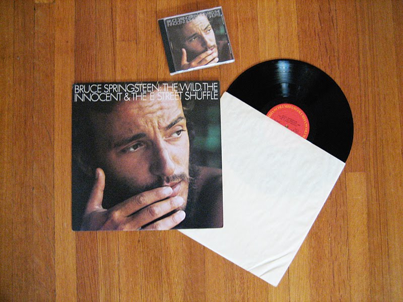
Referring to a CD as an album is a continuation of the use of the word for a collection of songs on a Long Playing (LP) vinyl disc (initially in either 10″ or 12″ formats, later in predominantly 12″ format), an earlier medium for selling music. The fact that many CDs were reissues of earlier vinyl albums, as in Bruce Springsteen’s The Wild, The Innocent & The E-Street Shuffle, made the association an easy one. The thing is, many vinyl albums aren’t much more than a highly decorative (and often informative) cardboard sleeve with an internal paper sleeve containing a vinyl disc. That’s not much like a photo album either. Why is a vinyl record also called an album?

A book-like 78 RPM album of music by Saint Saens

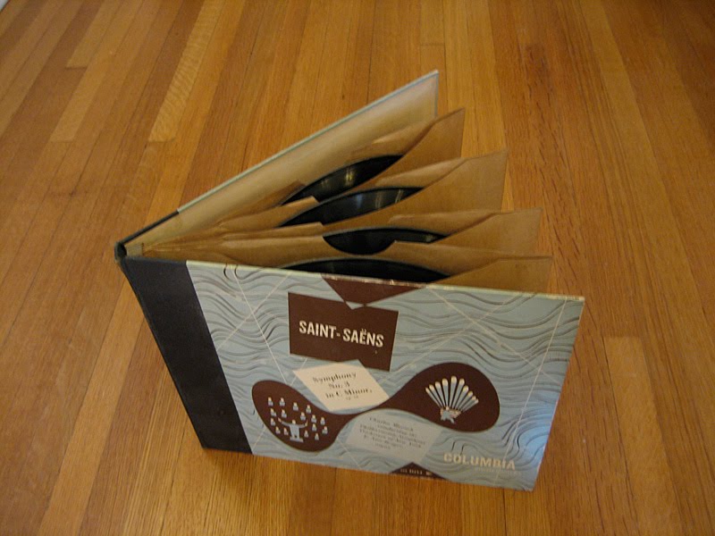
Go back a little further, and you find the 78 rpm record medium that preceded vinyl albums. While a vinyl record could easily hold as much as 40 minutes of music, 78s were much more limited. Each 78 could hold only a few minutes of music, and was typically sold in a plain paper sleeve. 78s were sometimes sold as a group for longer pieces of music that couldn’t fit on a single disc, classical music pieces being a prime example. For such a group, the 78s were kept in paper sleeves bound into an album, as in this release of Symphony No. 3 in C Minor by Saint-Saëns. And that’s very much like a photo album.

A book-like 78 RPM album of music by Nat King Cole

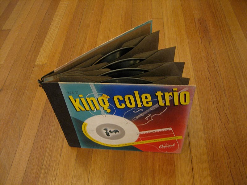
It wasn’t a big leap to collect previously released songs into an album of 78s. Nat ‘King’ Cole was a hit maker whose music has been repackaged extensively over the years, going back to the 78 era.

A CD packgae that mimics a book-like album of 78 RPM records

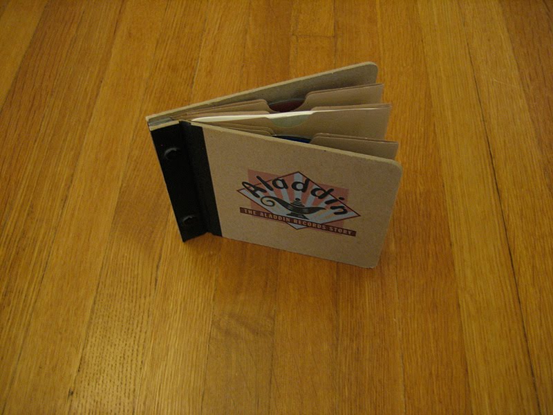
Finally, here’s an example where the packaging of a product is deliberately evocative of an earlier form for reasons other than metaphor. Aladdin was a record label that released songs in the 78 rpm disc medium. A CD of reissues from a few years ago featured a package design that resembled an album of 78s.

I’m curious to see what Apple comes up with, if anything, to bring yet another variation to the music album.