This is a recommendation?

Netflix is a service with which I have a love/hate relationship. Even with the comparatively slim pickings offered by the service in Canada, the monthly fee provides pretty good value. And, of course, the offerings became more compelling since they got into creating their own content, some of which is terrific. And being able to watch on multiple devices is a terrific feature, especially with playback synced across them.

I’ve never, though, enjoyed the experience of finding videos to watch. Scrolling through titles can be slow and imprecise. There’s no way for me to easily recall the videos that I want to watch; the “My List” feature reorders videos, making it hard to find something that I thought I had added. The “Suggestions for You” that it makes can sometimes seem cryptic — what, exactly makes for “Exciting Movies”? And I regularly find unhelpful recommendations along the lines of “Because you watched [title of video]” where the first listing is something else that I watched recently.

Screens showing Netflix recommendations based on ‘Stone’

Here’s a different unhelpful pair of recommendations that I ran into some time ago. Having watched a Robert De Niro movie called Stone (part of it, anyway), Netflix thought that I’d be interested in a movie called Stone Cold, as well as The Stoning of Soraya M. As far as I can tell, the movies have little in common other than similarities in their titles.

I get that this isn’t necessarily easy, and my response is mostly bemusement as the recommendations generally don’t add a lot of value for me. It just feels like discovery of what to watch is an untapped opportunity.

The power of creating something that’s just good enough

An iPhone with paper overlay for crafty screen manipulation

We had a fun day at Boltmade recently, engaging in a series of testing sessions with users to assess the usability of a product that we’re working on for a client.

We had made some extensive changes to a particular mobile workflow, and needed to create a testable artifact as quickly as possible. This scenario is well understood in the UX design world, and is pretty much par for the course when taking a Lean approach to creating a product. In this case there was a striking observation that emerged during testing that surprised us all.

The test artifact that we created used a mix of approaches: an existing product was used to show functionality that was already well-understood; paper screens were created to show new functionality; and a human simulated the product back-end by sending appropriate feedback messages through the existing product in response to user input.

We had a test rig set up that enabled some of the team to observe from another room while a user interacted with the new design on a mobile device. It was easy to watch progress on a large screen during each testing session and, as always, there were useful insights that emerged.

Every time the paper screen was overlaid on the mobile device by our test facilitator we chuckled, as it looked funny to see the paper slide into place on the big screen. None of the users, though, had any trouble with the switch from pixels to paper and back again. And the messages that were sent by one of our team to the mobile device created a smooth and easily understood experience.

But the most striking thing we saw only became obvious, even to us, at the end of the day.

Despite the test artifact being a mix of real and fake functionality that included pieces of paper overlaid on a device screen, it felt “real”. Each user was even asked to “enter” information onto the paper “screen”, and to then watch the response on the mobile device screen; it still felt “real”.

And it was “real” to such an extent that every user we tested with told us, either unprompted or when asked, that the messages they saw in the mobile app were coming from a system with some kind of clever A.I. behind it. The workflow provided such an immersive experience that even paper screens did nothing to break the illusion that we were testing with a “real” mobile app.

When testing a hypothesis in a Lean context, you don’t need to build a fully functional artifact. All you need is an artifact that is good enough to learn from during testing. And that can mean designing and prototyping before starting to build.

This post also appears over on the Boltmade blog.

Usability of passwords

Like many people, I have a large collection of online accounts to manage. Examples for me include various email accounts, Twitter, and this blog. My large collection means that I have many passwords to manage. I like to think that I create passwords that are reasonably secure as well as being memorable for me, but its an annoyance to do so on a large scale.

Despite their many drawbacks passwords are currently a pervasive part of online life. While it’s easy for some to mock users for using unsafe passwords, a more nuanced approach is to understand that people are quite adept at circumventing security that gets in the way of their goals. Donald Norman has written eloquently about the challenge of designing a usable product with security in mind.

Some of the usability challenges around managing passwords were reiterated for me when I recently updated the passwords associated with my various online accounts. By sweeping through all my accounts at once, I got a concentrated look at various design solutions used by service providers to support password management by their users. The results were decidedly mixed in terms of usability. This message on restrictions in creating a password wasn’t unusual:

When changing your password, please remember that it must be between 5 and 8 characters in length and should contain both letters and numbers. Special characters (e.g. #, &, @) must not be used as they will not be accepted by the system. Passwords consisting of all letters or all numbers are not recommended.

While the message is clear, the underlying restrictions make it hard to come up with a secure, yet memorable, password. (As an aside, I’ll add that while I have my own strategies for creating and using passwords, I’m not going to describe them here. I hope the reasons are obvious!)

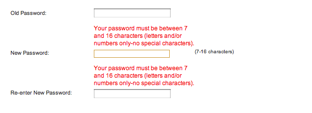
There are approaches to password creation that improve things a little.

One popular UI widget provides immediate inline feedback on the strength of a password that a user has defined for an account. I found several examples during my recent updates. Here’s one in particular that shows the feedback when I type in a terribly weak password for the account.

Screen image: ‘unsafe password’ warning

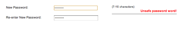
Not bad. The wording isn’t optimal but “Unsafe password” gets the job done. Here’s what appears when I provide a more secure password that includes a mix of letters, numbers, and special characters:

A screen showing feedback for a safe password

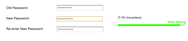
Again, the wording isn’t optimal but “Very strong” is fairly clear and also reassuring. Of course, the feedback is only useful when the guidance that it provides can be acted upon. Here’s what I see after trying to save the new password:

An error screen for a password that is too long

It turns out that my “very strong” password choice is too strong for this service!

Obviously, security is far from an easy problem to solve, and no single solution fits all needs. Having said that, this particular example from just one small sliver of a secure system is clearly bad design from a user experience perspective. The initial feedback is accurate in its assessment of the security of my desired password, but it’s irrelevant because the system won’t accept the password. The later feedback comes at a point in the workflow where it’s more frustrating than informative.

If passwords have to be a part of a product or service, design for them in a way that doesn’t needlessly decrease usability.