A visit to San Francisco for Interaction 15

Awesome speakers at Interaction 15

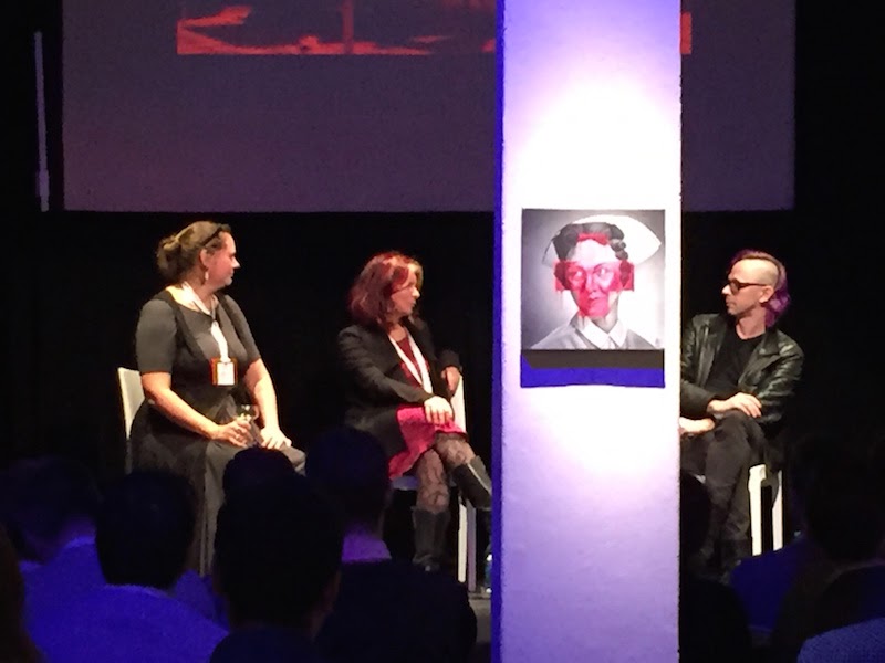
(Christina, Maria, and Jesse. Julie is behind the column!)

Last week Bob Barlow-Busch and I travelled to San Francisco for Interaction 15, this year’s edition of the annual conference of the IxDA. I had previously attended the 2013 edition in Toronto.

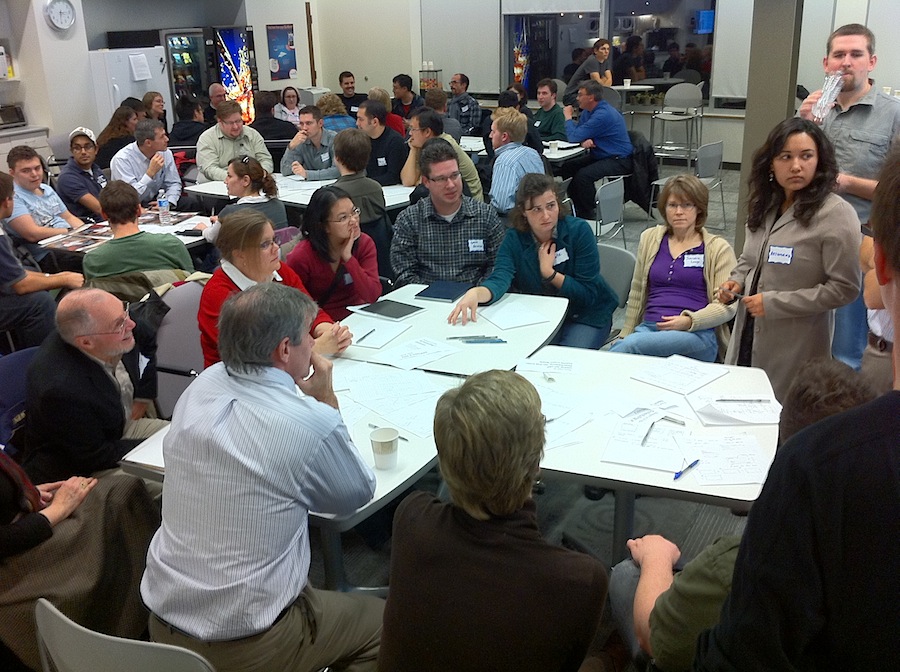
The conference is large, with 800+ people attending from around the world. The main venue was the Yerba Buena Center for the Arts, a terrific facility right downtown.

The program was a multi-track mix of topics, presented as talks, workshops, and panel discussions. Bob and I were pleased to see that there were several Fluxible alumni on the program, delivering new talks or material that they had previously done at Fluxible.

There were a few definite highlights for me.

“So, You Want To Run a Design Agency…” was a panel discussion with Christina Wodtke, Jesse James Garrett, Maria Giudice, and Julie Stanford. They were insightful and shared much from their years of experience running agencies. The fact that they all took shots of bourbon when one of them said the word “process” was a hilarious bonus.

“Jumping to the End: Practical Design Fiction at Google Creative Lab & BERG” had Matt Jones sharing some of the work that he’s done at those companies, and featured several fun looking projects.

Elizabeth Goodman’s “Beyond Handwaving: The Role of Performance in Interaction Design” did a good job of making explicit many of the things that I do intuitively when presenting a design to stakeholders.

The absolute highlight on the program for me was “The Modern UX Organization”, in which Fluxible alumnus Leah Buley presented the results from a study that looked at how top-performing design organizations work. It was data-driven and filled with astute observations.

For me, though, the most value at a conference like this comes from the conversations with friends old and new. The IxDA community is a friendly one, and there was plenty of opportunity to engage and learn. Whether through networking events, studio tours, meals, or just hanging around, the conversations were a huge part of the experience.

Finally, it was a treat to enjoy warmer temperatures in San Francisco. When we left for home at the end of the conference it was 16ºC there, and when we arrived in Waterloo Region it was -20ºC. Yup, still winter.

Airplane routes and chartjunk

While traveling home from UX Camp Ottawa, Bob Barlow-Busch and I had a fun discussion about our airplane’s route as presented to us by the seat-back, enRoute system. The system cycles through multiple screens showing information about our trip in progress.

Here’s a photo of a route map, showing us flying west from Ottawa to Toronto. The airplane icon moves from right to left over the course of the trip. The map is presented at a variety of other scales as well. (As an aside, a segment of the route trace is missing at the start.)

Flight path map on an airplane seat back

Here’s a photo of what looks like a simplified route map. The airplane icon moves from left to right over the course of the trip. That’s the opposite direction to what is shown in the earlier map.

Flight path map on an airplane seat back

What’s going on is that the second map is really a progress indicator that has been “enhanced” through the addition of a curved grid and the use of a curved progress line. These enhancements seem to be meant to evoke a 3-dimensional route through the air. The problem is that when shown right after the previous map, the direction of travel is reversed for our particular trip. The system has a generalized approach to representing any given trip, and in the case of ours this conflicting presentation is the result.

A simple solution would be to create a progress indicator that is devoid of what Edward Tufte calls chartjunk. A clearer presentation would be unlikely to look like a flight trace.

Isn’t that fun?

As an aside, Bob and I were quite aware that we were flying through the air at high speed on a regularly scheduled flight, and that give that context this was a pretty minor issue for us!

Scrolling in the Apple TV UI

I’ve written before (here, here, and here) on the differences between scrolling on an Apple Macintosh and scrolling on an iOS device like an iPhone, and how those differences are going away.

It turns out that there remains at least one remote corner of the Apple universe where the reconciliation of gestural meaning is still a little awkward.

The Apple TV is a content delivery device that provides an elegant user experience for delivering content from a variety of sources to a television screen. It includes a wonderfully simple remote control that is generally a delight to use. One less than delightful aspect of the remote control, though, is the cumbersome method for entering text, such as when searching content. Happily, Apple provides an iOS app called Remote, which can be used to control the Apple TV and which enables easier text input using a keyboard.

Of course, the Remote app can control all aspects of the Apple TV, using a gestural UI that one would expect from iOS. It’s here that things get a little awkward.

Note the following models:

  • On a Mac (in OS X Lion), dragging two fingers on on the track pad moves the contents of a window (e.g., scrolling through a list)
  • On iOS, a swipe gesture moves the screen (e.g., scrolling through a list).
  • On Apple TV, clicking the arrows on the remote control moves the on-TV-screen selection indicator (e.g., selecting an item in a list).

Using a swipe gesture in the Apple TV Remote app, which in effect turns the iOS device into a trackpad when used this way, also repositions the on-TV-screen selection indicator. This is quite similar to the behaviour of the gesture on a Mac trackpad prior to Lion, where the gesture controlled a UI widget (scrollbar) rather than the content itself; it is the selection indicator that is being controlled by the gesture not the screen content. This makes sense for a point-and-click remote control, but not for a gestural one.

For me the awkwardness arises when scrolling through a long list, such as many rows of movies.

That is, when scrolling vertically the selection indicator stops moving in the middle of the list view port, and the list moves through the selection indicator. The experience for me feels strongly like the swipe gesture is moving the list in the opposite direction to the swipe. As a result, I use the regular remote control for navigating screens on Apple TV, one click at a time, and I use an iOS device for entering text when needed. This isn’t really optimal and I’m curious to see how the Apple evolves and improves the experience.

A brief update on Fluxible

Logo: Fluxible - A User Experience Event

I mentioned Fluxible a few weeks back. Since then, we’ve been busy rounding up speakers and rounding out the Fluxible team.

Bob and I are thrilled with the speaker roster, and humbled that so many top user experience professionals have agreed to join us at our Fluxible event this year. As I write this, we’ve already announced six of them, and more announcements are coming shortly.

We’re also thrilled and humbled with the volunteers who have come on board to make this thing happen. An adventure of this size is beyond what the two of us could do on our own (despite our experience presenting monthly uxWaterloo meetings). Thanks to everyone for your faith and interest in Fluxible.

You can watch our ongoing progress via our Twitter account @Fluxible and at the Fluxible site.

Fluxible is coming to Waterloo

Logo: Fluxible - A User Experience Event

It’s a bit of a soft launch, but yesterday my friend Bob Barlow-Busch and I announced something that we’re planning for September 2012. It’s user experience event called Fluxible, and we’re pretty excited about it. As long-time organizers of uxWaterloo, Bob and I know that there’s a lot of great UX-related activity in our community and we want to introduce Waterloo Region to the rest of the UX world. We also want to bring some of the UX world here. As we put it on the currently-simple launch site:

Coming September 2012 to Waterloo Region: 2 fantastic days with some of the world’s top UX pros. Hone your skills at this fun and social event! Fluxible’s format mixes hands-on workshops with informative presentations, tours of leading global businesses, and plenty of chances to make new friends over great food and drinks.

We’re still working on details, of course, but we hope to reveal more in the coming weeks. Meanwhile, sign up to receive email updates about the event as we announce them, and follow Fluxible on Twitter. And, if you’re comfortable doing so, please share the news about Fluxible with anyone that you think might be interested.

A new post, written on an iPad

For some time now, Google has been in the midst of a major refresh and consolidation of the design (and implementation) of its products. As of Wednesday this week, that design work has now extended to Blogger, the platform that I happen to use for this blog. At first glance, the new Blogger looks and works great. One major benefit of the revamp is that I can now write and edit posts on my iPad. That wasn’t possible on the previous version — or, at least, I wasn’t able to do so. The update doesn’t appear to be optimized for mobile — in fact, it’s a little flakey — but it does work. Maybe there’s more to come?

This post is about about little more than creating a test post on my iPad, while also taking the opportunity to express my admiration for what they’ve been releasing these past months. Google+ has been getting the bulk of the attention, but there’s great work being done on their other products as well.

Adding albums to the music mix

LPs by John Cage and Bruce Springsteen

I spent some time over the holidays updating the music on my iPhone. That’s something that I do periodically, as it has far less capacity than would be required to hold my music collection and I like to vary what I listen to. The sources for the tracks are varied. Some I download from iTunes and other sources. I often digitize music that I have on CD. Less often, I digitize music that I have on vinyl albums or 45s, and doing so recently got me thinking about mix tapes.

I’ve created them, in the distant past, and enjoyed the reverence for the form in Nick Hornby’s High Fidelity (in both novel and film versions). Still, it had been many years since I made a mix tape, and even a few years since my last round of vinyl digitization. In the intervening time I had filtered from my memory just how out tedious it can be to digitize more than a few tracks. I retained only a fuzzily idealized notion of savouring each track while it is transferred to digital form (or, as I did in days gone by, cassette tape). That notion holds for the first few tracks, but the novelty does wear off! Here’s a simplified version of the steps required to digitize a track:

  • Connect the turntable to the computer.
  • Pull the record from it’s sleeve and put it on the turntable.
  • Start the turntable and drop the needle on the track; set recording levels to be loud but not so loud that distortion is introduced during the loudest passages.
  • Once levels are set, drop the needle again, but before the piece starts.
  • Start the digitizing/recording.
  • Enjoy the track while it plays.
  • When the track has finished, stop the digitizing/recording.
  • Remove the record from the turntable and replace it in its sleeve.
  • Edit the digitized track to eliminate any silence at the start and end of the track.
  • Add track to iTunes and add meta data to taste (Track name, Artist, sleeve art, etc.)
  • Repeat as necessary.

Obviously there are workflow optimizations available (e.g., record a batch of tracks, then edit them, then add meta data), but it’s still a laborious process. It was even more so in the past when the target was a cassette tape and the process included selecting tracks to efficiently fill a fixed length tape, manually minimizing silence between tracks, and creating cover artwork by hand.

Anyway, in the end I realized that I don’t at all miss the tedium of creating mix tapes the old-fashioned way, or digitizing analog formats. I do, though, love listening to the iPhone-age equivalent of mix tapes.

Designing the BlackBerry user experience at RIM

Joey Benedek presnts at uxWaterloo

Following our November 16 event with Google’s Adam Baker, the November 24 meeting of uxWaterloo featured a terrific presentation by Joey Benedek, Director of User Research at Research in Motion, on designing for user experience at the mobile pioneer.

Joey focused on examples from BlackBerry OS 6 in a presentation that was funny, frank, and insightful in its examination of the challenges that RIM faced in this major upgrade to the user interface of its iconic products.

Joey gave some specific examples of how user experience techniques were applied to specific design challenges. For example, a diary study, in which user participants kept a diary and recorded how they worked with BlackBerry, was used to inform the design of universal search in OS 6. Card sorting, another classic technique, was used to understand how to organize the configuration of options in OS 6.

He was pretty direct about the need to deliver a major improvement in the BlackBerry user experience in a short amount of time — the overhaul was accomplished in just nine months. He was also pretty direct about the company’s logic-driven culture, and how an understanding of, and level of comfort with, the UX organization’s process and data helped make the case for what needed to be done.

Joey provided some great observations that may challenge the perception of RIM in some quarters. As Joey put it in response to a question, “There’s no confusion on our part about whether people are enterprise users or consumers. They’re all humans.” Later, he added “We don’t pick users. We pick contexts of use,” and “I’m a fan of the classic usability test”.

Overall, it was a treat to hear from Joey, and we all appreciated his presence at uxWaterloo.

Julie Rutherford has provided a more detailed summary over at the uxWaterloo site.

Designing for everyone at Google

Groups of people at tables working on a design exercise

As expected, it’s been a busy month. As a result I’ve let some obvious blog posts slip. Time to catch up!

Last week’s uxWaterloo meeting was a particularly interesting one, as it featured a design workshop facilitated by Adam Baker, a user experience designer at Google.

Adam divided the large crowd (over 70) into groups of four and gave each group a design to complete as well as a constraint. It turns out that there were only two designs being worked on amongst the groups, though there were several constraints.

After a short period of design activity, Adam directed that pairs of groups merge. At this point we discovered that half the groups were designing a user interface for specifying a pizza to buy, while half were designing a user interface for specifying delivery instructions. We now had groups of eight, and needed to integrate our designs for pizza and delivery UIs into a whole design. We also had to handle new constraints, as each former group of four brought one to the new group of eight.

After another short period of design, the groups were merged again, resulting in larger groups of 16 or so, and a larger group of constraints in each group. The larger groups engaged in a final period of design work, after which each group shared their results with the larger meeting crowd. At this point it became clear that the constraints were quite varied: design for someone just like you; design for iPad; design for an old BlackBerry for use on a train; design for 9-year olds; design for blind; design for first-time users; design for 100 pizzas delivered to 100 locations, etc.

The exercise was a practical demonstration of some of the challenges for user experience at Google, where designing for everyone (many millions) carries with it many specific and even opposing requirements.

Adam followed up with a fine presentation in which he identified some of the design considerations that are important when designing for search at Google. He likened it to travel in the “back country”, where a premium is placed on solutions that are lightweight, field-repairable, multi-purpose, few frills (are fast), degrade well, and are adaptable.

Famously, Google places an emphasis on measurement, which informs design rather than dictating it. Amongst the kinds of questions they ask, and look to measurements for answers, are “How long…”, “How many…”, “How ofter…”, and “When…”. Nothing earth-shaking there, but the rigour with which they approach measurement is striking.

All in all, it was a highly successful night, and there may be similar uxWaterloo events in the future. Stay tuned.

A busy calendar for November

November features a full slate of local events that I’m looking forward to.

StartupCampWaterloo is, at this point, well-known in the technology community. I’ve always enjoyed attending the events, and have presented there in the past as well. At the tenth edition on Nov 10, Rick Stroobosscher and I will be talking about, and showing, what Karos Health is doing. As an aside, this is right in the middle of Entrepreneur Week, a yearly “innovation festival dedicated to entrepreneurial spirit”.

I’m particularly close to a couple of organizations that have three fine events coming up, and I’m going into carnival barker mode here!

uxWaterloo has not one, but two, events this month. The first, on November 16, is Lessons from designing at Google, a workshop presented by Adam Baker, a user interface designer at Google. Closer to home, we’re excited to have Joey Benedek speaking on November 24 about User Experience at Research in Motion. Both these visits have been in planning for some time, and we’re happy that the stars aligned to bring these exceptional speakers to the group. Register soon, as these have become two popular events.

Another group that I help organize is Ignite Waterloo. We’re putting on a fourth event on November 18. and are pretty excited about the talks that we have lined up. Be sure to get your tickets if you haven’t already, as tickets are moving fast.

Somewhat farther afield, in Guelph, the fifteenth edition of DemoCampGuelph is happening on November 17. It’s always a good time, as past posts here should indicate. Happily, I’ll be just sitting back and enjoying the talk and beer at this one!

Plenty to do!