December UX Group event

The next UX Group meeting, on Tuesday December 15, aims for equal parts socializing and design discussion. It’s the second annual December Product Potluck. Don’t bring food, but do bring a product or products whose design you find worthy of discussion. Anything is fair game, as the goal is lively discussion about design. Last year’s version was lightly attended due to winter weather, but let’s not be deterred by that! Moreover, we had a great discussion during the November meeting and it would be wonderful to continue the conversation this month.

Note that for this month we’re holding the event at McMullan’s on King, a fine pub in Uptown Waterloo. I know from StartupDrinksWaterloo that the venue is well-suited to an event like this. We have a fine UX community here in Waterloo Region, and it’s worth the effort to get out and meet. I hope to see you there.

Sipping from the data hose

I’ve been wondering what it means to have access to vast amounts of data and information. In particular, I’ve been thinking about the implications, from a user experience perspective, when users assume that data is accurate and synchronized.

Google Maps recently added Street View coverage for Waterloo, Ontario, where I live. As many other people did, I spent some time exploring my city, and there were some interesting revelations. For example, I noticed that pictures of my own house probably came from two different days, based on stuff visible in our yard. Moreover, I was able to pin down one of the days to about three specific dates last spring, based on the apparent weather and on the presence of a car belonging to my brother, who visited from out of town. Fun discoveries!

I also noticed that there’s a mismatch between the street view imagery and the aerial/satellite photo imagery. I’m sure that many other people have noticed this before in other cities, and that it’s not particularly exciting news, but sometimes an issue needs to hit close to home (figuratively and literally) to get my attention.

Screen image: Google Streetview in Waterloo

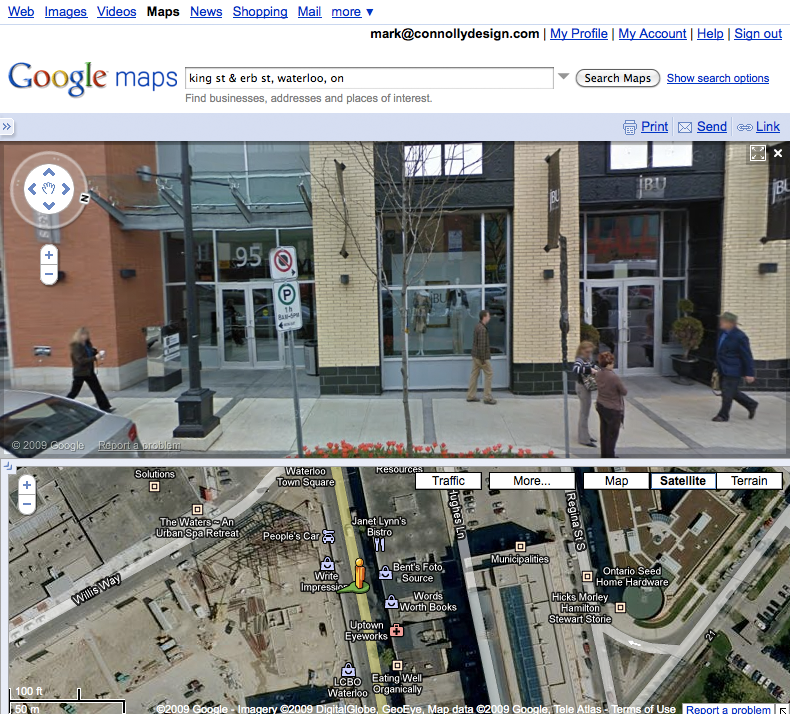
Here’s a simple example. On King Street, there was some new development work done several years ago. The aerial/satellite imagery in Google Maps shows work in progress. Street View imagery shows completed buildings.

(See this example on Google Maps, though depending on when you access this link the imagery for the aerial view, the street view, or both may have been updated. The image shown on the right preserves the mismatch that I’m writing about.)

A mismatch like this is pretty easy to spot. It’s much bigger than one I alluded to regarding my house, which really only I might notice. What does it mean, though, when a business on a street view image closes and is replaced by another? What does it mean when users add their own photos? How does the addition of historical imagery (in Google Earth at this point) contribute to the mix? Does the fact that the Street View images are taken at different times matter at all?

In short, as more and more data is added to Google Maps, how do such data synchronization issues affect the user experience? I know that I find myself making implicit assumptions about the underlying data (for example, that the it is relatively synchronized chronologically), in part because I find the experience so immersive.

I’m sure that this isn’t an issue specific to Google Maps by any stretch. It’s just visible there, which got me thinking about what it might mean; I’m not yet sure what all the implications are!

November UX Group meeting on Thursday

The November meeting of the UX Group of Waterloo is on Thursday. This session is a group discussion on a big UX topic:

This month we want to explore the factors and issues that will have an impact on user experience design in the near future. As the world goes mobile, what does it mean for users? If everything is accessible, how can it all be managed? What does the move from point-and-click to tap-and-pinch mean? Bring your own issues and questions, and share them in a group discussion with our inquisitive and curious UX community. If you have online videos or other resources to share, let’s have a look at them.

Check out the details and make sure to come out and share your thoughts.

iPhone as infinite music generator

Many years ago I discovered Brian Eno’s ambient music through vinyl LP releases like Discreet Music, Music for Airports, and others. The generative aspects of these pieces were appealing to me, and I found the results to be quite beautiful. The only weakness in the pieces, for me, was the limitation of appearing on vinyl albums in short segments. I wanted the pieces to play uninterupted for much longer.

In the mid-eighties, the introduction of the compact disc provided an option that supported longer playing times, and Eno took advantage of that with Thursday Afternoon, a CD-specific version of music he had composed for a video project. That was a CD that I repeatedly played for hours at a stretch while I worked on various design projects. (More recently, the videos from the series have been released on DVD.)

Skipping ahead to the current millennium, last year Eno collaborated with Peter Chilvers to create Bloom, an iPhone app that provides an essentially infinite number of possibilities for ambient pieces. Bloom relies on the computer at the heart of the iPhone to generate music based on minimal input from the user/creator/listener. The results are wonderful, though I did notice that Bloom runs the battery down more quickly than simply listening to Thursday Afternoon does, for obvious reasons. Bloom feels like the ultimate realization of the promise of Eno’s earlier ambient pieces, and has the great advantage of working on a mobile device. As an aside, I think Bloom was the second app that I bought for my iPhone.

Recently I discovered that there was an update to Bloom available. I downloaded it right away, and discovered a few enhancements to the app. More intriguingly were the links to two new apps with a similar heritage: Trope, by Eno and Chilvers again, and Air, by Chilvers and Sandra O’Neil. I’ve bought both, as they are ridiculously inexpensive, and am slowly working my way through them.

What is that I find so striking about these apps? First, as I’ve already written, they seem to deliver on what has in the past felt to me like the unrealized potential of Eno’s generative music. Second, they play to the gestural strengths of the iPhone user experience to deliver a simple application that anyone can use to make music in collaboration with the creators of the apps. Finally, the simple update to Bloom provided a great way to let me know about the newly available Trope and Air.

A lot has been written in recent years, by more thoughtful observers than me, on the state of the music industry and its struggles with new technologies. These three apps feel to me like one way to address a new technology head on and create something new and vital in the process.

Learn about personas at the next UX Group meeting

This month’s UX Group of Waterloo Region meeting is on Thursday October 15 and features a special treat. My Primal Fusion colleague Robert Barlow-Busch will be doing a presentation on personas. Bob will draw upon his own ‘stories from the trenches’ to help you to understand how to get the best from this product design tool. Come on out and enjoy the learning opportunity, and meet other folks in Waterloo Region’s thriving UX community.

Raising and lowering the volume on an iPhone

I’m an iPhone owner and I think it’s a pretty amazing device. It’s not perfect, of course, but I’m generally happy to live within the bounds of its constraints and take advantage of its strengths. Any device that breaks new ground, though, is bound to have its own idiosyncrasies. Here’s one on the iPhone that’s more amusing than annoying for me, but it does occasionally trip me up.

An iPhone in vertical orientation, showing controls

The iPhone includes a hardware-based volume control in the form of a pair of buttons. When viewed in vertical orientation, the buttons are at the top of the left edge of the device. Pressing the higher button (1) makes the volume go up, or higher. Pressing the lower button (2) makes the volume go down, or lower. So far, pretty straightforward. There’s a clear mapping between the buttons and their effect on the volume

There’s a little twist introduced when in the iPod app. There is also a volume control in the form of a slider on the touchscreen (3). Dragging the slider to the right raises the volume and dragging it to the left lowers the volume. Pressing the volume buttons will move the slider too. The slider is is oriented perpendicularly to the hardware buttons, but it works.

An iPhone in horizontal orientation, showing controls

Things get more interesting when viewing the iPhone in horizontal orientation. The two hardware buttons are now at the left side of the bottom edge of the device. Pressing the left button (1) makes the volume go up, or higher. Pressing the right button (2) makes the volume go down, or lower.

Here’s where things get most interesting. In the YouTube app there is a volume slider (3) that is identical in functionality to the one in the iPod app. That is, dragging the slider to the right raises the volume and dragging it to the left lowers the volume. So far, so good. Pressing the volume buttons will still move the slider too, but with counter-intuitive results. Pressing the left button moved the slider to the right, raising the volume. Pressing the right button moved the slider to the left, lowering the volume.

One could make the case that the slider and the hardware controls are behaving consistently regardless of orientation, which is true. The trouble is that the consistent behaviour leads to an unexpected result when the iPhone is in horizontal orientation. In the end, though, it might not matter much, since it’s only a problem when the slider is visible on screen. The YouTube app usually hides the controls, and the hardware control obviously works without the slider being visible. Still, it’s an interesting quirk.

IDEA2009 is in the rear view mirror

A presenter on stage at the Idea09 conference

IDEA2009 has come and gone and I’ve been reflecting upon my experience there. The event was well-organized and in a fine location in downtown Toronto (MaRS). There was a diverse set of presentations over the two days of the conference; it was mix of good and very good, with useful information nuggets in all. Highlights for me included Leisa Reichelt’s story of working with the Drupal open source community, Matthew Milan’s Innovation Parkour, Stephen Anderson’s take on Seductive Interactions, Christina Wodtke’s tour of great design ideas, and Mari Luangrath’s engaging tale of how she grew her business using Twitter.

Happily, the slide decks for the presentations are being made available online. I need to trawl through the Twitter feeds to find them!

UX Group of Waterloo Region kicks off new season

A new season of UX Group of Waterloo Region fun starts this Thursday, September 17 at 5:30pm at the Accelerator Centre. This first event, inspired by Scott Berkun, will be a design interactionary, an evening of hands on design fun in which teams take solving on design challenges in a ridiculously short amount of time. It promises to be good fun, and it’s a great opportunity to get to know other designers in our community and get to work with them.

Check out the details, and note the RRSP. Sadly, I’ll have to miss this great event myself due to immovable commitments elsewhere.

A metaphor several times removed

There have been reports, recently, that Apple will reveal a new focus on albums on iTunes sometime soon. This news got me thinking about the use of metaphor in designing a user experience.

There are a couple of kinds of ‘albums’ available to users of Apple products (Mac, iPod, iPhone). One is a photo album, which is a collection of photos. The metaphor makes sense, as a digital photo album has a strong association with its physical world counterpart, in which photos are kept in pages bound into an album.

Another is an album of songs, which is a collection of tunes typically assembled for purchase together. The most recent physical world counterpart of a digital album of tunes is probably an album in compact disc (CD) form, a convenient medium for selling music. The metaphor also makes sense, though compact disc really isn’t much like a photo album — why is it also called an album?

An LP and a CD of a Bruce Springsteen album (‘The Wild, The Innocent & The E Street Shuffle’)

Referring to a CD as an album is a continuation of the use of the word for a collection of songs on a Long Playing (LP) vinyl disc (initially in either 10″ or 12″ formats, later in predominantly 12″ format), an earlier medium for selling music. The fact that many CDs were reissues of earlier vinyl albums, as in Bruce Springsteen’s The Wild, The Innocent & The E-Street Shuffle, made the association an easy one. The thing is, many vinyl albums aren’t much more than a highly decorative (and often informative) cardboard sleeve with an internal paper sleeve containing a vinyl disc. That’s not much like a photo album either. Why is a vinyl record also called an album?

A book-like 78 RPM album of music by Saint Saens

Go back a little further, and you find the 78 rpm record medium that preceded vinyl albums. While a vinyl record could easily hold as much as 40 minutes of music, 78s were much more limited. Each 78 could hold only a few minutes of music, and was typically sold in a plain paper sleeve. 78s were sometimes sold as a group for longer pieces of music that couldn’t fit on a single disc, classical music pieces being a prime example. For such a group, the 78s were kept in paper sleeves bound into an album, as in this release of Symphony No. 3 in C Minor by Saint-Saëns. And that’s very much like a photo album.

A book-like 78 RPM album of music by Nat King Cole

It wasn’t a big leap to collect previously released songs into an album of 78s. Nat ‘King’ Cole was a hit maker whose music has been repackaged extensively over the years, going back to the 78 era.

A CD packgae that mimics a book-like album of 78 RPM records

Finally, here’s an example where the packaging of a product is deliberately evocative of an earlier form for reasons other than metaphor. Aladdin was a record label that released songs in the 78 rpm disc medium. A CD of reissues from a few years ago featured a package design that resembled an album of 78s.

I’m curious to see what Apple comes up with, if anything, to bring yet another variation to the music album.

An affordance worth writing about

My friend James Wu recently wrote an essay on the design of motorcycle turn signals. It’s a great read that has sparked some lively discussion and is well worth checking out. James starts off with a tip of the hat to The Design of Everyday Things by Donald Norman, which is probably the first book that I read on the kind of design that I do now. It’s certainly the place where I first encountered the word affordance, a quality of an object, or an environment, that allows an individual to perform an action

Reading the essay reminded me of an incident that I had shared with James some time ago while we were working together.

A pen lying on ruled paper

I was in a meeting where I needed to sign quite a few documents. Someone handed a ballpoint pen to me, and I started on the first document, only to realize that the pen wasn’t working — the writing point wasn’t out. I tried to extract the writing point, and was a little confused as I fumbled with the pen trying to figure out how to make it write. There was no clickable end, and turning the barrel didn’t work. I finally noticed, on looking more closely, that the shiny chrome end where I expected the writing point to appear had no hole and could not possibly accommodate a point.

A pen with its cap removed

A little more exploration revealed that this pen had a cap at the other end, which was covering the point. The faux point was strikingly similar to the business end of the pen, and, indeed, to many other pen points. The affordance was strongly one of write with this end. Even now, knowing which end of the pen gets the job done, it’s easy for me to look at it and be misled. Whatever the merits of the pen’s design, they’re negated by an affordance that’s misaligned with the pen’s functionality.

Pen with cap removed

I was so struck by the ingeniously hidden writing point on this pen, that I remarked on it to the person who had handed it to me, explaining my professional interest. He told me that others had been thrown by this style of pen as well, and he let me keep it as a memento of the meeting.

Since that meeting I’ve informally tested out the pen on people when the opportunity arose to do so, and wasn’t surprised to find that some of them mis-read the pen as well. I’ve kept the pen, in a safe place, as a tangible reminder of the importance of affordance in design.