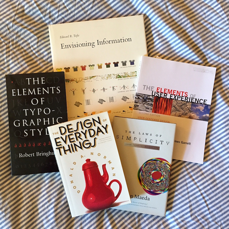
Following up on my earlier post, here’s a second set of books in an informal series on recommended UX reading.
As a reminder, the series isn’t meant to provide a definitive list, but rather a set of books that I’ve enjoyed and found helpful in my UX work. Some of them will be well known and already widely recommended. Others may be less so, though no less valuable to me. A few might even be eccentric choices for a list like this. And some of them might make for excellent beach reading this summer!
Enjoy!
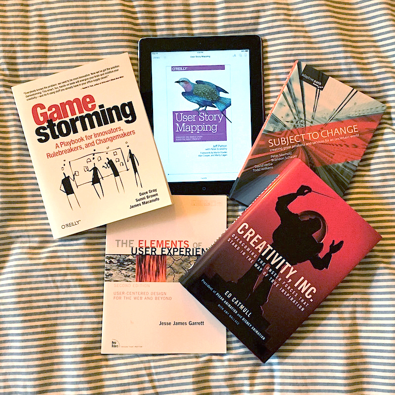
User Story Mapping: Discover the Whole Story, Build the Right Product
by Jeff Patton, Peter Economy
A thoughtful, practical, and collaborative approach to thinking about products. We’re big on user story mapping at Boltmade.
The Elements of User Experience
by Jesse James Garret
One of the defining books on UX by the well-respected author, researcher, and practitioner, as well as co-founder of Adaptive Path.
Subject To Change: Creating Great Products & Services for an Uncertain World
by Peter Merholz, Brandon Schauer, David Verba, Todd Wilkens
Another insightful book on product design from the folks at Adaptive Path (a company since acquired by Capitol One).
Creativity, Inc.: Overcoming the Unseen Forces That Stand in the Way of True Inspiration
by Ed Catmull
Loads of insights on how to organize a team for creative collaboration, from the co-founder of Pixar.
Gamestorming: A Playbook for Innovators, Rule-breakers, and Changemakers
by Dave Gray, Sunni Brown, James Macanufo
Plenty of hands-on activities that are useful in the UX world and beyond.