The power of creating something that’s just good enough

An iPhone with paper overlay for crafty screen manipulation

We had a fun day at Boltmade recently, engaging in a series of testing sessions with users to assess the usability of a product that we’re working on for a client.

We had made some extensive changes to a particular mobile workflow, and needed to create a testable artifact as quickly as possible. This scenario is well understood in the UX design world, and is pretty much par for the course when taking a Lean approach to creating a product. In this case there was a striking observation that emerged during testing that surprised us all.

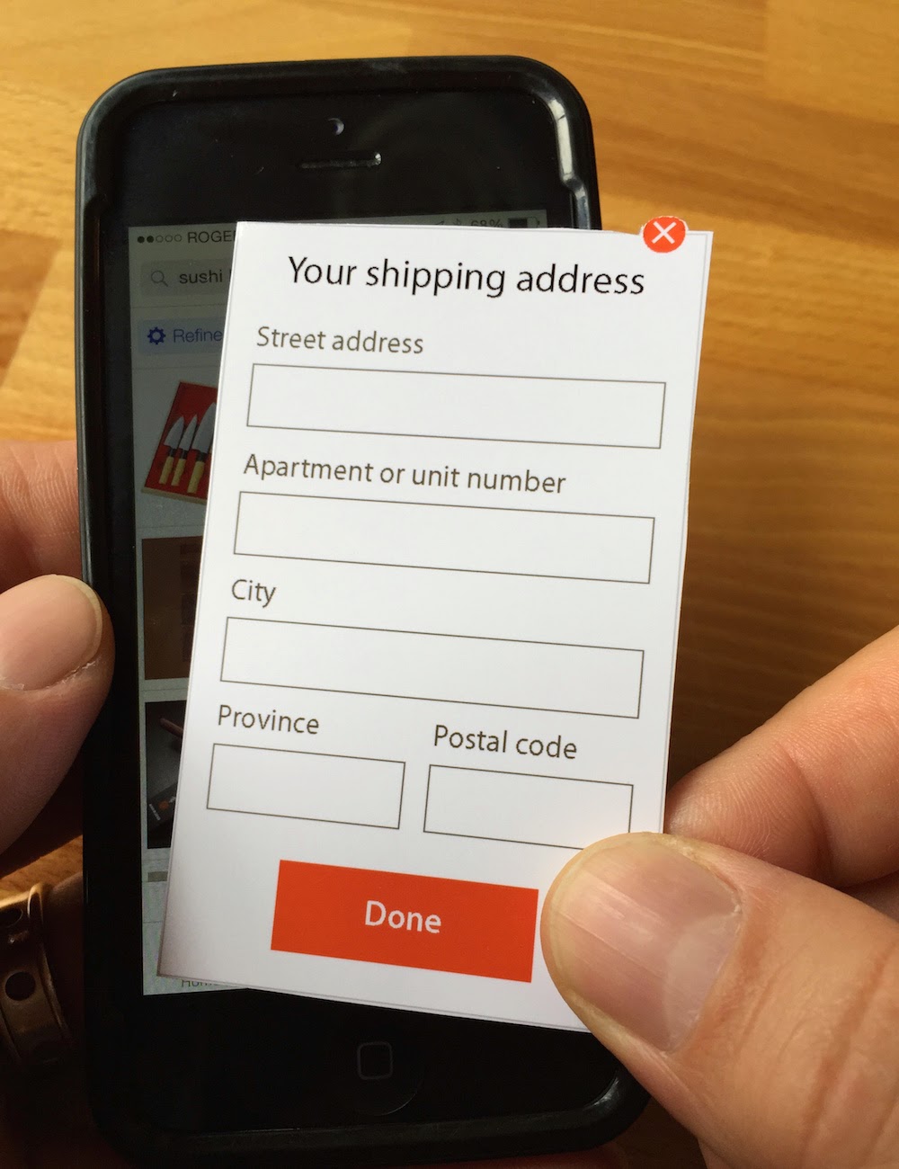
The test artifact that we created used a mix of approaches: an existing product was used to show functionality that was already well-understood; paper screens were created to show new functionality; and a human simulated the product back-end by sending appropriate feedback messages through the existing product in response to user input.

We had a test rig set up that enabled some of the team to observe from another room while a user interacted with the new design on a mobile device. It was easy to watch progress on a large screen during each testing session and, as always, there were useful insights that emerged.

Every time the paper screen was overlaid on the mobile device by our test facilitator we chuckled, as it looked funny to see the paper slide into place on the big screen. None of the users, though, had any trouble with the switch from pixels to paper and back again. And the messages that were sent by one of our team to the mobile device created a smooth and easily understood experience.

But the most striking thing we saw only became obvious, even to us, at the end of the day.

Despite the test artifact being a mix of real and fake functionality that included pieces of paper overlaid on a device screen, it felt “real”. Each user was even asked to “enter” information onto the paper “screen”, and to then watch the response on the mobile device screen; it still felt “real”.

And it was “real” to such an extent that every user we tested with told us, either unprompted or when asked, that the messages they saw in the mobile app were coming from a system with some kind of clever A.I. behind it. The workflow provided such an immersive experience that even paper screens did nothing to break the illusion that we were testing with a “real” mobile app.

When testing a hypothesis in a Lean context, you don’t need to build a fully functional artifact. All you need is an artifact that is good enough to learn from during testing. And that can mean designing and prototyping before starting to build.

This post also appears over on the Boltmade blog.

Bypassing clarity with LinkedIn

LinkedIn is one of the most successful social media networks and, with its focus on career, it’s a valuable tool for many of us.

I’ve noticed that I receive many requests to connect that contain nothing more than the default message that LinkedIn provides. As a result, I’m not sure why the request has been made. Generally, that’s not a huge problem if it’s someone I know. When it’s someone I’ve never met and don’t know, though, it can make it hard for me to accept the request and I often don’t.

There’s at least one reason for those default requests that is addressable by LinkedIn. When accessed from some places, the workflow for making a connection request includes an opportunity for the requestor to include a custom message. It could be something like “Hey, great to see you at uxWaterloo last week. Let’s stay in touch about that Fluxible conference!”, which is actually pretty helpful for me. In other places, though, the workflow doesn’t provide that opportunity, which means that the default message is what appears in the request. This feels like a design gap to me. LinkedIn should ensure that it’s always an option for requestors to provide a custom message.

And if you’re using LinkedIn, take advantage of the opportunity to provide a little context and to explain why you want to connect!

Precise imperfection in the Yahoo Weather app

Screen image: Yahoo Weather app showing precise numbers

The Yahoo Weather app has been widely, and deservedly, praised as an example of a beautifully conceived and executed native app. I agree with those assessments, and use it on my iPhone most days to try to understand how many facets of Canada’s weather I might expect to experience in the coming hours and days.

There’s one detail, though, that stands out as gratingly wrong for me. It’s such a small detail that to point it our seems petty, but in an app that otherwise is of such high quality this tiny detail stands out.

While I can configure the app to use metric measurements for temperatures and wind speeds, it uses a mix of imperial and metric in the text summary of the forecast. The imperial measurements are shown first, with a precisely calculated metric equivalent shown in parentheses. In the example shown here, that makes for an awkwardly presented result of “High around 35ºF (1.7ºC)”. Wind speed presentation is similarly awkward.

The word “around” shouldn’t be followed by such a precise measurement. Beyond that, the text summary should just show me the metric measurements if that’s what I’ve configured.

On an unrelated note, I’m looking forward to seeing some warmer temperatures showing up in the app…

Craft beer and improvised music in Uptown Waterloo

Joe Sorbara performing on a drum kit at NUMUS concert

Last Friday I enjoyed an evening of craft beer and improvised music, a combination that’s perfect for me.

I started by meeting my friend David for a quick beer at Abe Erb, the brew pub that opened in Uptown Waterloo this past fall. I love the atmosphere, with its distinctive and local style that feels just right. I also love the selection of beers, with an emphasis on their own fine offerings but augmented with beers from other Ontario craft breweries. Lovely!

Next, David and I walked over to the Button Factory for a NUMUS concert featuring three terrific improvising musicians. The event was a part of their Mix Series, which focuses on “improvisational music and emerging artists”.

Kathryn Ladano, who has also performed at each edition of Fluxible, started the night off with a set of explorations on bass clarinet. Next was Alison Cameron performing on a variety of digital, analog, and acoustic instruments. Finally, Joe Sorbara gave us a grand musical tour around his drum kit. Each of the three musicians delivered mesmerizing individual performances before joining together for a group improvisation. The event finished off with all three answering questions from the audience and talking about their approaches to their music. It was a delightful concert, and I need to get out to more NUMUS events.

A visit to San Francisco for Interaction 15

Awesome speakers at Interaction 15

(Christina, Maria, and Jesse. Julie is behind the column!)

Last week Bob Barlow-Busch and I travelled to San Francisco for Interaction 15, this year’s edition of the annual conference of the IxDA. I had previously attended the 2013 edition in Toronto.

The conference is large, with 800+ people attending from around the world. The main venue was the Yerba Buena Center for the Arts, a terrific facility right downtown.

The program was a multi-track mix of topics, presented as talks, workshops, and panel discussions. Bob and I were pleased to see that there were several Fluxible alumni on the program, delivering new talks or material that they had previously done at Fluxible.

There were a few definite highlights for me.

“So, You Want To Run a Design Agency…” was a panel discussion with Christina Wodtke, Jesse James Garrett, Maria Giudice, and Julie Stanford. They were insightful and shared much from their years of experience running agencies. The fact that they all took shots of bourbon when one of them said the word “process” was a hilarious bonus.

“Jumping to the End: Practical Design Fiction at Google Creative Lab & BERG” had Matt Jones sharing some of the work that he’s done at those companies, and featured several fun looking projects.

Elizabeth Goodman’s “Beyond Handwaving: The Role of Performance in Interaction Design” did a good job of making explicit many of the things that I do intuitively when presenting a design to stakeholders.

The absolute highlight on the program for me was “The Modern UX Organization”, in which Fluxible alumnus Leah Buley presented the results from a study that looked at how top-performing design organizations work. It was data-driven and filled with astute observations.

For me, though, the most value at a conference like this comes from the conversations with friends old and new. The IxDA community is a friendly one, and there was plenty of opportunity to engage and learn. Whether through networking events, studio tours, meals, or just hanging around, the conversations were a huge part of the experience.

Finally, it was a treat to enjoy warmer temperatures in San Francisco. When we left for home at the end of the conference it was 16ºC there, and when we arrived in Waterloo Region it was -20ºC. Yup, still winter.

Fluxible dates announced!

Giles Colborne presenting at Fluxible

And, just like that, we’ve announced the dates for Fluxible 2015! Our next edition of the UX party disguised as a conference is happening on September 26 & 27, 2015. As we revealed over there:

Like last year, Fluxible will take place in the Communitech Hub and Tannery Event Centre, in the heart of downtown Kitchener. Some exciting events will happen during the preceding week as well, so stay tuned for details. Further announcements will begin shortly, and we hope you’ll be as excited as we are!

As usual, we have some delightful surprises in store, so stay tuned! And what better way to stay tuned than to join our mailing list? You’ll get all the best news before anyone else!

The Fluxible offseason is a busy one

Compared with the excitement around last September’s event, the Fluxible offseason may seem quiet. Behind the scenes, though, there’s plenty of activity as we plan for our September 2015 edition. We have dates and venues pretty much nailed down, if not announced, but there’s still much to do.

The main focus of activity for Bob Barlow-Busch and me right now is on finding speakers to bring to town. This is one of the most rewarding and fun parts of putting on our UX conference. We get to meet and talk with smart people who are passionate about UX, and who want to share their knowledge and experience. Recruiting continues, but we’ve already got some fantastic speakers lined up, with some terrific topics that they’ll be bringing to the event. There’ll also be a few surprising topics that are sure to delight attendees!

We’re pretty excited about how it’s shaping up. While it’s still a little early to be making any announcements, we’ll start doing that soon.

Talking about about design artifacts

On Friday I visited the REAP Felt Lab to talk with a group of people about design artifacts.

It was a bit of an overview of some of the things used to communicate a design to the various stakeholders in a product development project. As time was limited, the focus was on representations of the user interface. That is, while they’re important, we didn’t get into such useful research artifacts as personas or scenarios or journey maps.

We did cover such obvious candidates as wireframes and prototypes in various levels of fidelity, exploring the different forms that they can take, and their strengths and weaknesses in different contexts. We also looked at sketches, which might have a more limited audience — maybe even just the designer in some cases — but which are something that I use on every design project. (As an aside, I’ve written before about pencils and how regularly I use them for sketching and more.)

The discussion was lively and the group was an engaging one. I always find it much more interesting to hear what other folks have to say, and welcomed the thoughts that everyone shared. My thanks to REAP for inviting me!

Boltmade is hiring

Logo: Boltmade

The new year is well underway, and at Boltmade we’ve cranked up the hiring machine. We’re looking for developers to join our team.

Needless to say, I think that Boltmade is a fantastic place to work!

We have a diverse set of clients that range in size from “two people with an idea” to Fortune 500. All of our clients care deeply about their products and want Boltmade to help them deliver something meaningful to the world. To do that, we have a skilled and engaged team of software developers and designers who truly enjoy building software products. And we do it well.

There’s plenty of opportunity to learn new things, collaborate with smart people, and enjoy a level of autonomy that encourages both. And we do it all in the historic and beautifully restored Bauer Building on King Street in Uptown Waterloo, where fine food and other amenities are a short walk away.

In short, we have terrific fun doing what we do!

If Boltmade sounds interesting to you, then get in touch with us! We’d love to talk with you.