Perils of a gestural UI

The iPhone was Apple’s first product that leapt completely into the world of gestural interface; it was later followed by the similar iPod Touch. The recent iPad looks to build upon the success of those products. While the iPhone isn’t perfect, as I’ve written previously, it’s a wonderful product for me.

The company’s gestural endeavours aren’t confined to new product categories. Apple has also built multi-touch gestural trackpads into various models of MacBook. I’ve never made a lot use of the extended capabilities in the trackpads — I found two-fingered scrolling to be pretty awkward (though rotation is fine for me).

While I hadn’t previously tried to analyze my response, I recently took a closer look and figured out what has thrown me about scrolling using the trackpad. To paraphrase Inigo Montoya in The Princess Bride, “You keep using that gesture. I do not think it means what you think it means.” Let me explain.

On the iPhone, dragging my finger on the display causes what’s visible on the screen to move in the direction that my finger is moving. A good example of this is seen in Safari, the iPhone’s web browser. If a web page doesn’t fit on the screen I can put my finger on the screen, drag it across the screen, and the web page moves with my finger. It’s as if the page were sitting on a table and I put a finger on the page to move it across the table in a particular direction. If I move my finger towards me, the page moves towards me — scrolling “up” on the screen. If I move my finger away from me, the page moves away from me — scrolling “down” on the screen.

The trackpad on my MacBook is different. Using Safari as an example again, when viewing a web page the entire page may not appear within the browser window. I can scroll the page in a few ways. I can use the cursor to move the scroll bar, or I can use the arrow keys on the keyboard to move the scroll bar. The key in both these cases is that I’m controlling the scroll bar, which in turn scrolls the page. A third way to scroll the page is via two-finger scrolling on the trackpad. Here is where things get interesting. If I move my fingers towards me, the page moves away from me — scrolling “down” on the screen. If I move my fingers away from me, the page moves towards me — scrolling “up” on the screen. These behaviours are the opposite of what’s happening on iPhone. The reason is that two-fingered trackpad scrolling is linked to moving the scroll bars rather than moving the page directly.

Moving back and forth between iPhone and Mac made it easier for me to finally identify the source of my trackpad scrolling discomfort.

This really feels like a collision between the historically dominant interaction paradigm as found in Mac OS X and Windows, and a new gestural paradigm as seen on iPhone. For me, when I’m gesturing to scroll I’m moving the page, not the UI control. iPhone supports that model. The MacBook trackpad doesn’t. The question I have is, how many more of these collisions will appear as Apple continues to build on its gestural UI (and, of course, as other companies add their own twists).

The Apple iPad and ubiquitous computing

One of the things that strikes me about the iPad that Apple introduced last week is the name. It’s attracted a fair amount of derision and ridicule, just as the iPhone has drawn flak in some circles for its being such a closed, tightly controlled system.

(I should make it clear at this point that I myself love Apple’s products and have been using them for two decades.)

To me, though, the iPad name (and, by extension, the whole iPad/iPhone family of products) harkens back to work done at Xerox PARC in the late 1980s and early 1990s on ubiquitous computing. That term was coined by the late Mark Weiser and it’s an area that he helped define. Here’s a great prediction from Wesier in 1988:

For thirty years most interface design, and most computer design, has been headed down the path of the “dramatic” machine. Its highest ideal is to make a computer so exciting, so wonderful, so interesting, that we never want to be without it. A less-traveled path I call the “invisible”; its highest ideal is to make a computer so imbedded, so fitting, so natural, that we use it without even thinking about it. (I have also called this notion “Ubiquitous Computing”, and have placed its origins in post-modernism.) I believe that in the next twenty years the second path will come to dominate. But this will not be easy; very little of our current systems infrastructure will survive. We have been building versions of the infrastructure-to-come at PARC for the past four years, in the form of inch-, foot-, and yard-sized computers we call Tabs, Pads, and Boards. Our prototypes have sometimes succeeded, but more often failed to be invisible. From what we have learned, we are now exploring some new directions for ubicomp, including the famous “dangling string” display.

Note that Tabs were envisioned as quite-small computing devices, much like the current iPhone or iPod Touch. Pads were somewhat larger, much like the new iPad. Boards were larger-still, wall-mounted smart boards, or perhaps like today’s Microsoft Surface. 20-plus years later, Apple is delivering on the vision of ubiquitous computing with an ever-evolving suite of products and services. (Many observers also point back to Apple’s Newton MessagePad of the early 1990s as an ancestor of the current Apple products.)

My take, and it’s not a particularly clever or original one, is that the iPad, like the iPhone before it, isn’t meant to be seen as a general purpose computer. It’s an appliance for which the user doesn’t need to be aware of what’s going on under the hood — the computer is invisible. iPad users just get stuff done anywhere and at any time. Moreover, iPad is part of a larger Apple ecosystem that includes the iPhone and traditional Macs, but also a suite of cloud-hosted services that Apple is long-rumoured to have been working on.

The better these devices can deliver services invisibly and ubiquitously, the better the experience will be for many people. Not all people, of course — many will still opt for more open systems and solutions. There will always be other options available, from companies such as Google, but Apple’s direction is an important one.

iPhone as infinite music generator

Many years ago I discovered Brian Eno’s ambient music through vinyl LP releases like Discreet Music, Music for Airports, and others. The generative aspects of these pieces were appealing to me, and I found the results to be quite beautiful. The only weakness in the pieces, for me, was the limitation of appearing on vinyl albums in short segments. I wanted the pieces to play uninterupted for much longer.

In the mid-eighties, the introduction of the compact disc provided an option that supported longer playing times, and Eno took advantage of that with Thursday Afternoon, a CD-specific version of music he had composed for a video project. That was a CD that I repeatedly played for hours at a stretch while I worked on various design projects. (More recently, the videos from the series have been released on DVD.)

Skipping ahead to the current millennium, last year Eno collaborated with Peter Chilvers to create Bloom, an iPhone app that provides an essentially infinite number of possibilities for ambient pieces. Bloom relies on the computer at the heart of the iPhone to generate music based on minimal input from the user/creator/listener. The results are wonderful, though I did notice that Bloom runs the battery down more quickly than simply listening to Thursday Afternoon does, for obvious reasons. Bloom feels like the ultimate realization of the promise of Eno’s earlier ambient pieces, and has the great advantage of working on a mobile device. As an aside, I think Bloom was the second app that I bought for my iPhone.

Recently I discovered that there was an update to Bloom available. I downloaded it right away, and discovered a few enhancements to the app. More intriguingly were the links to two new apps with a similar heritage: Trope, by Eno and Chilvers again, and Air, by Chilvers and Sandra O’Neil. I’ve bought both, as they are ridiculously inexpensive, and am slowly working my way through them.

What is that I find so striking about these apps? First, as I’ve already written, they seem to deliver on what has in the past felt to me like the unrealized potential of Eno’s generative music. Second, they play to the gestural strengths of the iPhone user experience to deliver a simple application that anyone can use to make music in collaboration with the creators of the apps. Finally, the simple update to Bloom provided a great way to let me know about the newly available Trope and Air.

A lot has been written in recent years, by more thoughtful observers than me, on the state of the music industry and its struggles with new technologies. These three apps feel to me like one way to address a new technology head on and create something new and vital in the process.

Raising and lowering the volume on an iPhone

I’m an iPhone owner and I think it’s a pretty amazing device. It’s not perfect, of course, but I’m generally happy to live within the bounds of its constraints and take advantage of its strengths. Any device that breaks new ground, though, is bound to have its own idiosyncrasies. Here’s one on the iPhone that’s more amusing than annoying for me, but it does occasionally trip me up.

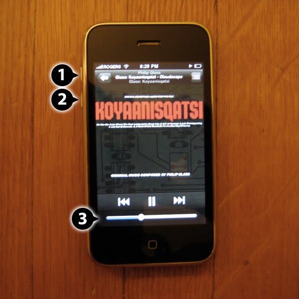
An iPhone in vertical orientation, showing controls

The iPhone includes a hardware-based volume control in the form of a pair of buttons. When viewed in vertical orientation, the buttons are at the top of the left edge of the device. Pressing the higher button (1) makes the volume go up, or higher. Pressing the lower button (2) makes the volume go down, or lower. So far, pretty straightforward. There’s a clear mapping between the buttons and their effect on the volume

There’s a little twist introduced when in the iPod app. There is also a volume control in the form of a slider on the touchscreen (3). Dragging the slider to the right raises the volume and dragging it to the left lowers the volume. Pressing the volume buttons will move the slider too. The slider is is oriented perpendicularly to the hardware buttons, but it works.

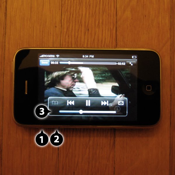
An iPhone in horizontal orientation, showing controls

Things get more interesting when viewing the iPhone in horizontal orientation. The two hardware buttons are now at the left side of the bottom edge of the device. Pressing the left button (1) makes the volume go up, or higher. Pressing the right button (2) makes the volume go down, or lower.

Here’s where things get most interesting. In the YouTube app there is a volume slider (3) that is identical in functionality to the one in the iPod app. That is, dragging the slider to the right raises the volume and dragging it to the left lowers the volume. So far, so good. Pressing the volume buttons will still move the slider too, but with counter-intuitive results. Pressing the left button moved the slider to the right, raising the volume. Pressing the right button moved the slider to the left, lowering the volume.

One could make the case that the slider and the hardware controls are behaving consistently regardless of orientation, which is true. The trouble is that the consistent behaviour leads to an unexpected result when the iPhone is in horizontal orientation. In the end, though, it might not matter much, since it’s only a problem when the slider is visible on screen. The YouTube app usually hides the controls, and the hardware control obviously works without the slider being visible. Still, it’s an interesting quirk.