Running a design sprint to increase project clarity and organizational capacity

Five people looking at and working with paper mounted on a glass wall

I recently ran a design sprint for Capacity Canada, an organization based here in Waterloo Region that helps charities and other not-for-profit organizations get better at governing and otherwise running themseves. In other words, they increase the capacity of these organizations to do good work. The design sprint that I ran was aimed at a new initiative that they are exploring, which is still in its early stages. My friend Matthew Reynolds introduced me to the initiative and to Cathy Brothers of Capacity Canada, and I was delighted to be able to help them move it forward.

As a designer, I’m pretty familiar with both the constituent parts of a design sprint, as well as the overall shape and framework that Google Ventures has refined and promoted with such success. And I had taken a workshop at Google last fall that teaches their own take on the GV design sprint. (The big difference is that they take a more flexible approach in terms of scheduling and duration of sprints.) And, of course, design for user experience is pretty core to what we do at Zeitspace.

We ran the five stages of this particular sprint in three days, and the sprint team’s efforts were pretty effective at generating results. Having said that, you have to have faith in the process to know that the uncertainty and confusion that appear early on will be resolved by the end of the sprint, with answers and insights that help move the project forward! Do check out Matthew’s take on the sprint, as I’ll forego going into too many details here.

It felt good to help clarify some options and otherwise help Capacity Canada via this design sprint. We’ll see where the project goes now.

Speaking of design sprints, I’ll be running a day-long design sprint workshop for the folks at Communitech as a part of their 2017 Tech Leadership Conference. If you’re at all interested in learning more, do check it out.

This post originally appeared on the Zeitspace blog.
Sprinting in California

Zeitspace Logo

I’m in Mountain View, California, right now, attending the Google Developer Experts Summit, an annual gathering of, well, Google Developer Experts. (My expertise in this context is, as some readers may guess, in UX.) It’s a chance to meet and learn from the many people who are a part of this global group. One session on the program that I’m excited about in particular is the full day Design Sprint Master Academy that’s happening on day two of the summit tomorrow.

Design sprints have become fairly visible in the last few years, especially the approach used at Google Ventures as outlined in the book Sprint: How to Solve Big Problems and Test New Ideas in Just Five Days. While many of the constituent parts have been well known to the broader design and software development communities for years, there’s a real value in the way that they’ve been pulled together into a coherent whole here.

The workshop/academy that I’m attending here is an immersion in the Google approach. It’s being run by Kai Haley, who spoke at Fluxible this past September and also ran a half-day workshop on the same topic. The workshop/academy promises to be good fun, and I’m looking forward to using what I learn here in design sprints with Zeitspace clients.

This post originally appeared on the Zeitspace blog.

Designing Fluxible

In the aftermath of Fluxible 2015 in September, the Fluxible team has been reflecting on how things went and thinking about next year’s edition. It’s an ongoing activity, really, as we look for ways to refine what we do to create a great conference experience.

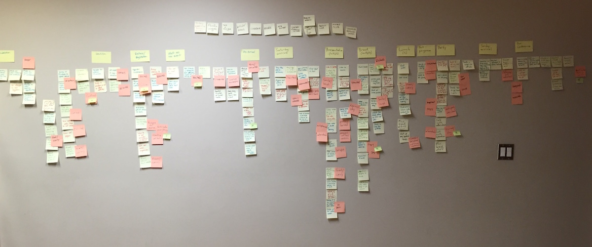
With many of us being user experience professionals, it’s inevitable that we bring our UX tools to bear on the task of improving Fluxible. Recently, we’ve engaged in several story mapping sessions to help us better articulate the experience of our attendees. It’s productive, as well as good fun, to think about the Fluxible experience this way.

User story mapping results: sticky notes on a wall

(User story mapping progress…)

Bob Barlow-Busch observed that the thinking and activities that go into designing a conference might be of wider interest, and suggested that we share some of what we go through. That does seem like a great idea and is something that we’re planning to do in the months leading up to Fluxible next year.

An Apple product with imperfections that improve over time

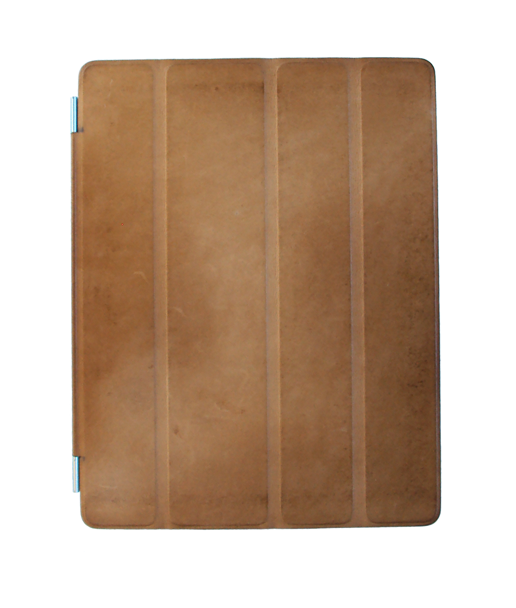
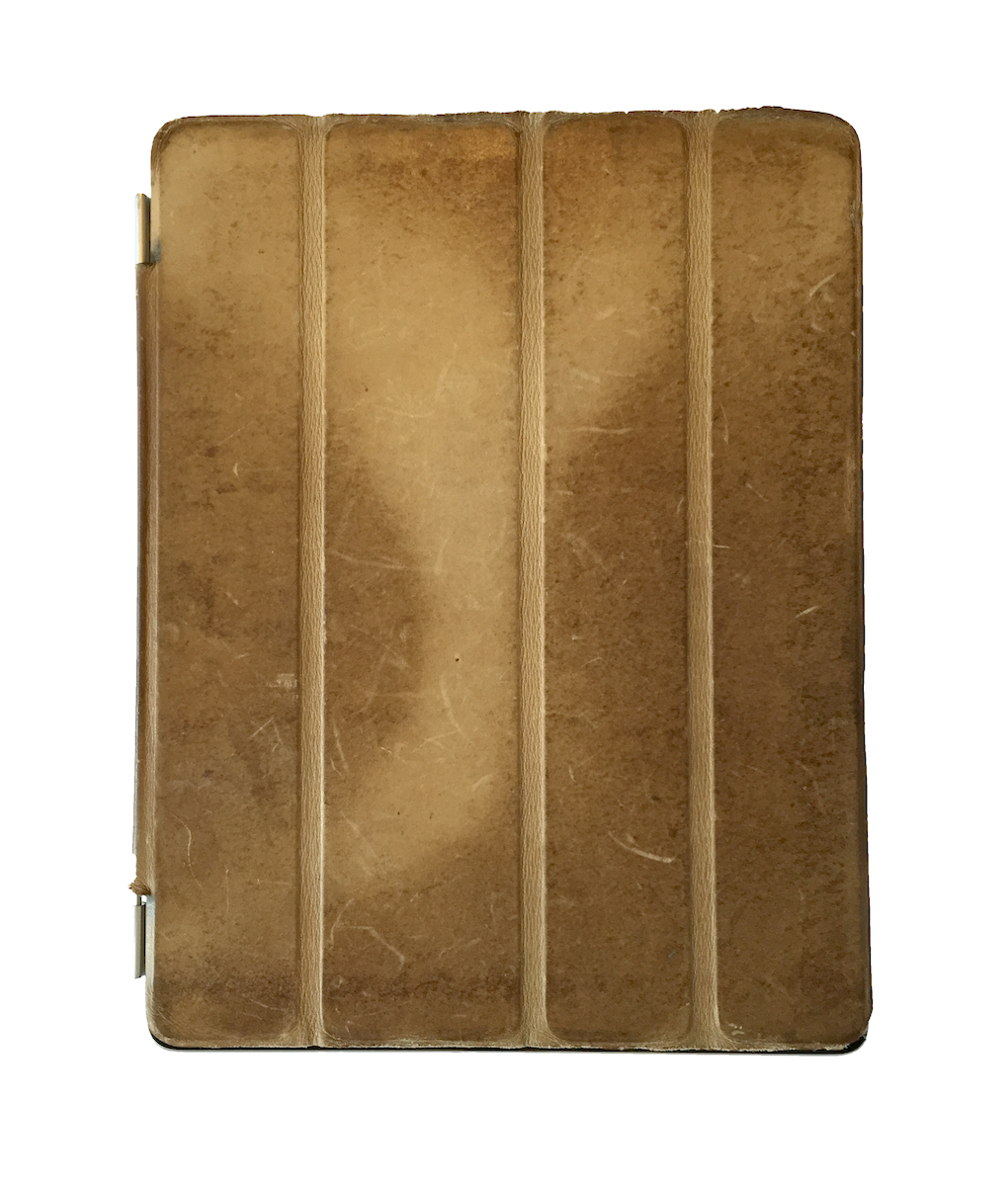
My iPad 2 with plenty of patina cover in 2015

(My iPad 2 cover in 2011)

I thought it would be be fun to revisit the cover of my Apple iPad 2.

As I’ve written in the past, one of the most striking aspects of the iPad design is the optional leather cover for the second model. Specifically, it transforms in appearance over time as it’s handled and acquires an imperfectly beautiful patina that’s specific to the owner and device. In 2011, only a few months after I had bought it, my cover had already changed in appearance from what it had been in its box.

Over time, the transformation has continued.

My iPad 2 cover in 2015

(My iPad 2 cover in 2015)

Today, almost four years later, the patterns of use imprinted on the cover in 2011 have become even more pronounced and deeply ingrained. The resulting contrast between the glass and aluminum iPad and the leather cover that protects it has become even more beautiful. Even allowing for inevitable differences in photographic conditions between then and now, the change in appearance is remarkable.

Wabi Sabi!

Using realistic data in a design prototype

I mentioned code-based prototypes a few weeks back. Here’s a related observation.

I like to put realistic-looking content into my higher-fidelity prototypes. The main reason for my preference is that, in many cases, a design can’t be effectively evaluated if it doesn’t present realistic data and/or information. You need to see how the design handles the real thing.

When I was at Karos Health, I regularly used the names of jazz musicians to create fake patient data that was used in various design prototypes. I did it for two reasons, the first being my preference for realistic data and/or information.

The second is more subtle: while the names looked realistic, anyone who recognized a name like Miles Davis or Louis Armstrong would realize that what was being shown wasn’t real real patient data. That was an important consideration in health care, where patient privacy is a critical concern. One of my favourite moments came when someone viewing a prototype noticed that a birthday shown for Miles Davis was correct. (In fact, all the birthdays were correct.) The attention to detail made an impression!

This is a recommendation?

Netflix is a service with which I have a love/hate relationship. Even with the comparatively slim pickings offered by the service in Canada, the monthly fee provides pretty good value. And, of course, the offerings became more compelling since they got into creating their own content, some of which is terrific. And being able to watch on multiple devices is a terrific feature, especially with playback synced across them.

I’ve never, though, enjoyed the experience of finding videos to watch. Scrolling through titles can be slow and imprecise. There’s no way for me to easily recall the videos that I want to watch; the “My List” feature reorders videos, making it hard to find something that I thought I had added. The “Suggestions for You” that it makes can sometimes seem cryptic — what, exactly makes for “Exciting Movies”? And I regularly find unhelpful recommendations along the lines of “Because you watched [title of video]” where the first listing is something else that I watched recently.

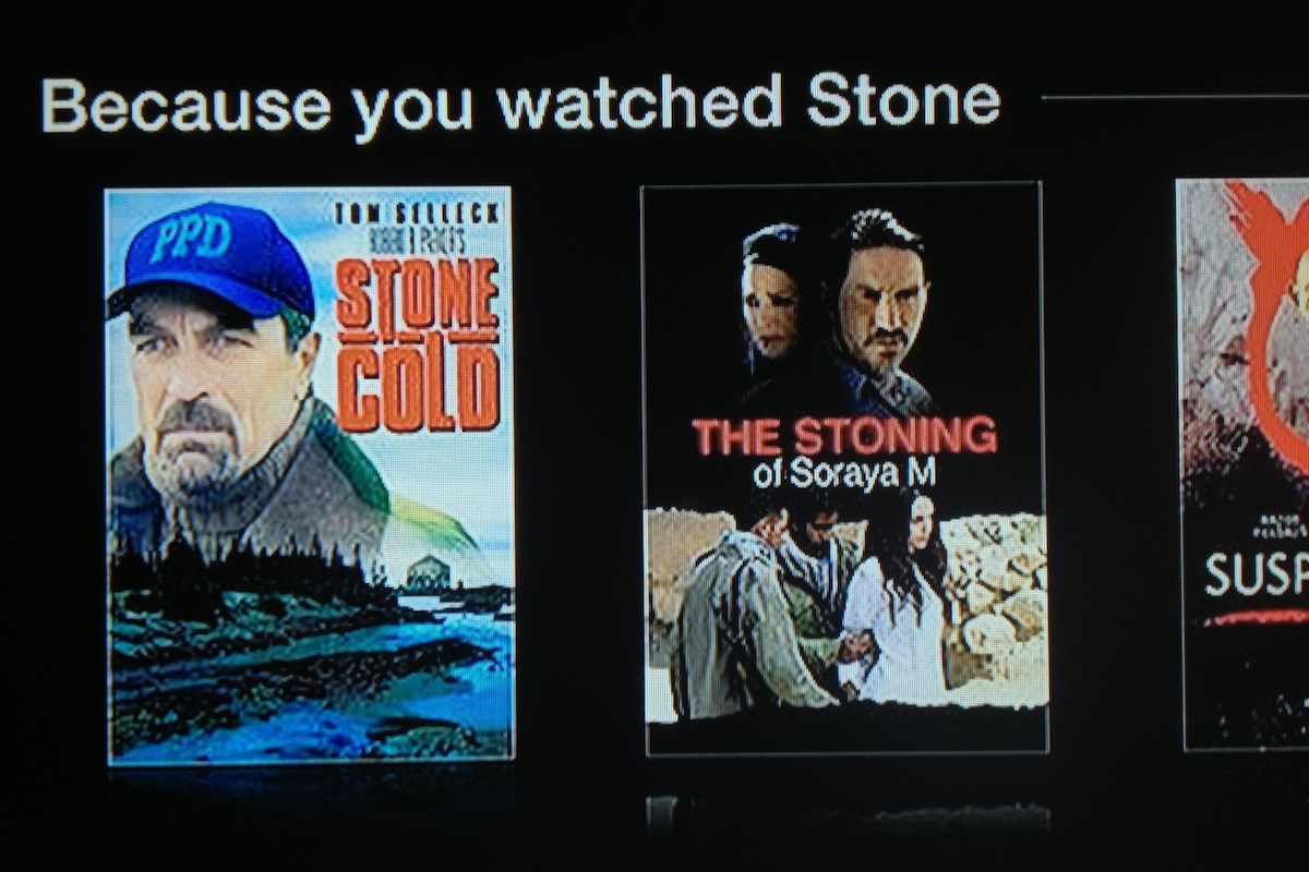
Screens showing Netflix recommendations based on ‘Stone’

Here’s a different unhelpful pair of recommendations that I ran into some time ago. Having watched a Robert De Niro movie called Stone (part of it, anyway), Netflix thought that I’d be interested in a movie called Stone Cold, as well as The Stoning of Soraya M. As far as I can tell, the movies have little in common other than similarities in their titles.

I get that this isn’t necessarily easy, and my response is mostly bemusement as the recommendations generally don’t add a lot of value for me. It just feels like discovery of what to watch is an untapped opportunity.

Why I write software code as a part of my design work

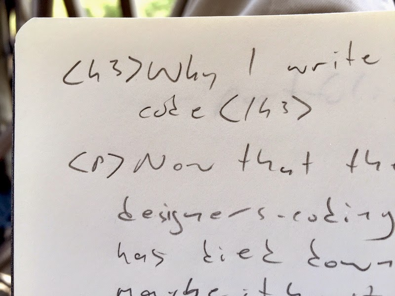
A closeup of hand-written code in a notebook

Now that the whole designers-coding-stuff thing has died down a little (or maybe it hasn’t?), I thought I’d share some thoughts on why I code on my own design projects. There are a couple of main reasons why I engage in this activity.

First, I believe that it’s important for me as a designer to have a solid understanding of the medium for which I’m designing. Being able to code helps me better understand the things that matter to developers on a software product team, and it enables me to communicate more effectively with them.

Second, creating prototypes is a part of the design process for me. Prototypes, in various levels of fidelity, help me think through what the interaction should be for a particular design solution. Obviously prototypes have other uses; they are great for communicating a design to product team members and, of course, they are central in the testing of a product design with users.

There are many tools available for creating product prototypes. As it turns out, though, because I’ve been coding with html/css/js for so many years now, I can actually work fairly quickly to create a code-based prototype that I can iterate on and refine efficiently. I’m able to create realistic interactions and behaviours that are a big challenge with other approaches. I can start with something crude and wireframe-ish and iterate to something more polished. I like to call late-stage, high fidelity, code-based prototypes “real software with fake functionality”! It might be best to avoid ray guns, though…

Bypassing clarity with LinkedIn

LinkedIn is one of the most successful social media networks and, with its focus on career, it’s a valuable tool for many of us.

I’ve noticed that I receive many requests to connect that contain nothing more than the default message that LinkedIn provides. As a result, I’m not sure why the request has been made. Generally, that’s not a huge problem if it’s someone I know. When it’s someone I’ve never met and don’t know, though, it can make it hard for me to accept the request and I often don’t.

There’s at least one reason for those default requests that is addressable by LinkedIn. When accessed from some places, the workflow for making a connection request includes an opportunity for the requestor to include a custom message. It could be something like “Hey, great to see you at uxWaterloo last week. Let’s stay in touch about that Fluxible conference!”, which is actually pretty helpful for me. In other places, though, the workflow doesn’t provide that opportunity, which means that the default message is what appears in the request. This feels like a design gap to me. LinkedIn should ensure that it’s always an option for requestors to provide a custom message.

And if you’re using LinkedIn, take advantage of the opportunity to provide a little context and to explain why you want to connect!

Precise imperfection in the Yahoo Weather app

Screen image: Yahoo Weather app showing precise numbers

The Yahoo Weather app has been widely, and deservedly, praised as an example of a beautifully conceived and executed native app. I agree with those assessments, and use it on my iPhone most days to try to understand how many facets of Canada’s weather I might expect to experience in the coming hours and days.

There’s one detail, though, that stands out as gratingly wrong for me. It’s such a small detail that to point it our seems petty, but in an app that otherwise is of such high quality this tiny detail stands out.

While I can configure the app to use metric measurements for temperatures and wind speeds, it uses a mix of imperial and metric in the text summary of the forecast. The imperial measurements are shown first, with a precisely calculated metric equivalent shown in parentheses. In the example shown here, that makes for an awkwardly presented result of “High around 35ºF (1.7ºC)”. Wind speed presentation is similarly awkward.

The word “around” shouldn’t be followed by such a precise measurement. Beyond that, the text summary should just show me the metric measurements if that’s what I’ve configured.

On an unrelated note, I’m looking forward to seeing some warmer temperatures showing up in the app…

Talking about about design artifacts

On Friday I visited the REAP Felt Lab to talk with a group of people about design artifacts.

It was a bit of an overview of some of the things used to communicate a design to the various stakeholders in a product development project. As time was limited, the focus was on representations of the user interface. That is, while they’re important, we didn’t get into such useful research artifacts as personas or scenarios or journey maps.

We did cover such obvious candidates as wireframes and prototypes in various levels of fidelity, exploring the different forms that they can take, and their strengths and weaknesses in different contexts. We also looked at sketches, which might have a more limited audience — maybe even just the designer in some cases — but which are something that I use on every design project. (As an aside, I’ve written before about pencils and how regularly I use them for sketching and more.)

The discussion was lively and the group was an engaging one. I always find it much more interesting to hear what other folks have to say, and welcomed the thoughts that everyone shared. My thanks to REAP for inviting me!