Delivering overnight at Karos Health

Last Friday we had our second FedEx Day at Karos Health. Our first FedEx day was, to me, a prototype to see how the event would work at our company. That first try was a great success, and we resolved to do it again. While the details of our approach are slightly different than those at the company whose FedEx Days inspired us, Atlassian, our take on the concept is similar in spirit and purpose. (By the way, it’s called a FedEx Day, as you have to deliver something overnight.)

For our second event I had two goals in mind for my own activity. The first was to learn more about Ruby on Rails, a programming language and framework combination which I had begun investigating earlier in the week and with which I already had built an exceedingly simple application for creating and managing patient records. My second goal was to explore an approach to publishing documents as defined by IHE. I picked one of the simpler scenarios (use cases, in IHE parlance) to try to deliver on:

A patient in the emergency department has all her relevant available documents retrieved via 240 XDS transactions. As initial triage of the patient is done, an additional document regarding diagnostic results for this patient is registered in the XDS Document Registry. Currently, there is no way for the Emergency department to learn about the existence of this new information. With a publish/subscribe infrastructure, the initial query to the XDS Document Registry would be accompanied with a subscription request, as a result of which a notification would be sent to the 245 emergency department. The subscription will be terminated once the patient is no longer under the care of the emergency department’s institution.

— from “Unexpected Notification Use Case”, section 26.4.1 of IHE IT Infrastructure Technical Framework Supplement: Document Metadata Subscription (DSUB) (PDF)

Put another way, an emergency department physician has requested an imaging study, such as an MRI, for a patient. The requesting physician needs to see the results, provided as a document, as soon as they are made available by the radiologist who read at the study images. A notification alerts the physician that the result document is available.

Working with two of my Karos colleagues, I used Rails to put together a simple web app prototype focused on what a physician might see on a smartphone (an iPhone, for demo purposes, as that’s what I use every day) when receiving a notification that a document has been made available or updated. We used a simple script to push notifications into the prototype’s back end, which dutifully made them available to the different colleagues that we were demoing to. Each notification includes a link to the affected document, which can be viewed right away. Happily, the prototype worked well and I’m thoroughly enjoying Ruby on Rails so far.

It was fun to build and show the prototype, and fun to see all the other results that emerged from a day of directed play at Karos. We’re all looking forward to the next FedEx day at Karos.

The prototype is done, let’s ramp up!

I wrote a little while back about the Research Entrepreneurship Accelerator Project at the University of Waterloo. The program got up and running for this past winter’s academic term, and saw a team of six students working on a prototype of an online marketplace in which artists and other content creators provide creative services for owners of Christie Digital MicroTiles. I was lucky to be able to work with the student team, as well as with the extended REAP leadership team.

Last Wednesday was the end-of-term presentation for the inaugural student REAP team, and I was happy to be able to see them present the results of their project to representatives for Christie. While I had seen the team’s work at various points during the project, the students still managed to surprise me. Their presentation was in the form of a play in which the team acted out the the scenarios that they had created in support of their design work. This was delightfully unexpected, but perhaps shouldn’t have been given that REAP is an initiative of the Arts faculty that happens to build cross-disciplinary teams.

Fittingly, the first REAP term was something of a prototype itself, and the lessons learned by everyone involved are already being applied as preparations move forward for the spring REAP term that starts in May. There are multiple projects lined up this time, with some interesting ideas to explore. The recruiting process is in its final stages — last night I had a chance to meet the student candidates for the next REAP teams —and I’m looking forward to supporting the new teams on their projects over the coming months.

The lion and the trackpad

Apple has released a version of the next version of Mac OS X, code-named Lion, to developers. That’s a fairly standard step on the release road for the company’s OS updates. In an article at AppleInsider, though, I noticed this interesting tidbit:

The new multi-touch gestures are designed to take advantage of the larger click TrackPads on more recent MacBook models, which could make them more difficult with older notebooks. Another strange quirk, people familiar with the developer preview said, is two-finger scrolling is reversed: to scroll down on a webpage in Safari, users must push up with their fingers, which is the opposite of how it works in Snow Leopard, but the same directly as scrolling on the iPad.

I’m pretty sure that nobody at Apple, or AppleInsider for that matter, reads this blog. Anyone who has read my previous post on scrolling from March of last year, though, will know that the change doesn’t feel like a strange quirk to me. It feels like the right direction to go, and Apple is clearly addressing the collision between old and new interaction paradigms.

Design Exchange 2011

It’s been a busy month, with the most recent Ignite Waterloo event and planning for uxWaterloo keeping me busy outside of my day job. I haven’t done a blog post here in a while, and I thought I’d start to catch up by letting you know about an event that I’m peripherally involved with.

Design Exchange Waterloo 2011 is a student-organized, design-focused forum that’s happening from 6:00pm to 9:00pm on Wednesday March 2 in room 2218 of the Tatham Center at the University of Waterloo. The DXW website is currently light on detail, but I can share a little more information that I know about. The coolest thing about this forum is that includes ten groups of students from four different areas (Faculty of Arts, Faculty of Engineering, Faculty of Environment, and School of Computer Science) presenting their design work. There also will be ample opportunity to discuss design, incubate ideas, and connect with a diverse group of students and industry professionals through their shared interest in design.

To that end, the organizers are hoping to see people from the off-campus community join the students for what looks to be a lively event. I can say from my own past experience that it’s well worth attending. At the last event, back in 2009, I even met a student whom we subsequently hired as an intern at Primal Fusion, an outcome that may have been unusual but which was more than welcome all around.

Here’s a my understanding of the agenda for March 2:

  • Introductions
  • 5 student presentations
  • 30 minute snack break (mingle period)
  • 5 student presentations
  • Awards for Best Presentations, Most Innovative Design
  • Concluding Statements

Should be an interesting event.

Usability of passwords

Like many people, I have a large collection of online accounts to manage. Examples for me include various email accounts, Twitter, and this blog. My large collection means that I have many passwords to manage. I like to think that I create passwords that are reasonably secure as well as being memorable for me, but its an annoyance to do so on a large scale.

Despite their many drawbacks passwords are currently a pervasive part of online life. While it’s easy for some to mock users for using unsafe passwords, a more nuanced approach is to understand that people are quite adept at circumventing security that gets in the way of their goals. Donald Norman has written eloquently about the challenge of designing a usable product with security in mind.

Some of the usability challenges around managing passwords were reiterated for me when I recently updated the passwords associated with my various online accounts. By sweeping through all my accounts at once, I got a concentrated look at various design solutions used by service providers to support password management by their users. The results were decidedly mixed in terms of usability. This message on restrictions in creating a password wasn’t unusual:

When changing your password, please remember that it must be between 5 and 8 characters in length and should contain both letters and numbers. Special characters (e.g. #, &, @) must not be used as they will not be accepted by the system. Passwords consisting of all letters or all numbers are not recommended.

While the message is clear, the underlying restrictions make it hard to come up with a secure, yet memorable, password. (As an aside, I’ll add that while I have my own strategies for creating and using passwords, I’m not going to describe them here. I hope the reasons are obvious!)

There are approaches to password creation that improve things a little.

One popular UI widget provides immediate inline feedback on the strength of a password that a user has defined for an account. I found several examples during my recent updates. Here’s one in particular that shows the feedback when I type in a terribly weak password for the account.

Screen image: ‘unsafe password’ warning

Not bad. The wording isn’t optimal but “Unsafe password” gets the job done. Here’s what appears when I provide a more secure password that includes a mix of letters, numbers, and special characters:

A screen showing feedback for a safe password

Again, the wording isn’t optimal but “Very strong” is fairly clear and also reassuring. Of course, the feedback is only useful when the guidance that it provides can be acted upon. Here’s what I see after trying to save the new password:

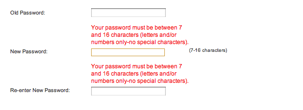
An error screen for a password that is too long

It turns out that my “very strong” password choice is too strong for this service!

Obviously, security is far from an easy problem to solve, and no single solution fits all needs. Having said that, this particular example from just one small sliver of a secure system is clearly bad design from a user experience perspective. The initial feedback is accurate in its assessment of the security of my desired password, but it’s irrelevant because the system won’t accept the password. The later feedback comes at a point in the workflow where it’s more frustrating than informative.

If passwords have to be a part of a product or service, design for them in a way that doesn’t needlessly decrease usability.

Designing the BlackBerry user experience at RIM

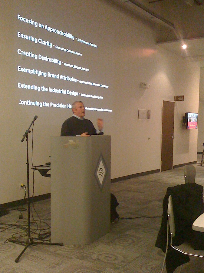
Joey Benedek presnts at uxWaterloo

Following our November 16 event with Google’s Adam Baker, the November 24 meeting of uxWaterloo featured a terrific presentation by Joey Benedek, Director of User Research at Research in Motion, on designing for user experience at the mobile pioneer.

Joey focused on examples from BlackBerry OS 6 in a presentation that was funny, frank, and insightful in its examination of the challenges that RIM faced in this major upgrade to the user interface of its iconic products.

Joey gave some specific examples of how user experience techniques were applied to specific design challenges. For example, a diary study, in which user participants kept a diary and recorded how they worked with BlackBerry, was used to inform the design of universal search in OS 6. Card sorting, another classic technique, was used to understand how to organize the configuration of options in OS 6.

He was pretty direct about the need to deliver a major improvement in the BlackBerry user experience in a short amount of time — the overhaul was accomplished in just nine months. He was also pretty direct about the company’s logic-driven culture, and how an understanding of, and level of comfort with, the UX organization’s process and data helped make the case for what needed to be done.

Joey provided some great observations that may challenge the perception of RIM in some quarters. As Joey put it in response to a question, “There’s no confusion on our part about whether people are enterprise users or consumers. They’re all humans.” Later, he added “We don’t pick users. We pick contexts of use,” and “I’m a fan of the classic usability test”.

Overall, it was a treat to hear from Joey, and we all appreciated his presence at uxWaterloo.

Julie Rutherford has provided a more detailed summary over at the uxWaterloo site.

Designing for everyone at Google

Groups of people at tables working on a design exercise

As expected, it’s been a busy month. As a result I’ve let some obvious blog posts slip. Time to catch up!

Last week’s uxWaterloo meeting was a particularly interesting one, as it featured a design workshop facilitated by Adam Baker, a user experience designer at Google.

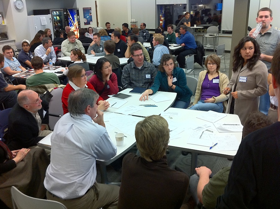
Adam divided the large crowd (over 70) into groups of four and gave each group a design to complete as well as a constraint. It turns out that there were only two designs being worked on amongst the groups, though there were several constraints.

After a short period of design activity, Adam directed that pairs of groups merge. At this point we discovered that half the groups were designing a user interface for specifying a pizza to buy, while half were designing a user interface for specifying delivery instructions. We now had groups of eight, and needed to integrate our designs for pizza and delivery UIs into a whole design. We also had to handle new constraints, as each former group of four brought one to the new group of eight.

After another short period of design, the groups were merged again, resulting in larger groups of 16 or so, and a larger group of constraints in each group. The larger groups engaged in a final period of design work, after which each group shared their results with the larger meeting crowd. At this point it became clear that the constraints were quite varied: design for someone just like you; design for iPad; design for an old BlackBerry for use on a train; design for 9-year olds; design for blind; design for first-time users; design for 100 pizzas delivered to 100 locations, etc.

The exercise was a practical demonstration of some of the challenges for user experience at Google, where designing for everyone (many millions) carries with it many specific and even opposing requirements.

Adam followed up with a fine presentation in which he identified some of the design considerations that are important when designing for search at Google. He likened it to travel in the “back country”, where a premium is placed on solutions that are lightweight, field-repairable, multi-purpose, few frills (are fast), degrade well, and are adaptable.

Famously, Google places an emphasis on measurement, which informs design rather than dictating it. Amongst the kinds of questions they ask, and look to measurements for answers, are “How long…”, “How many…”, “How ofter…”, and “When…”. Nothing earth-shaking there, but the rigour with which they approach measurement is striking.

All in all, it was a highly successful night, and there may be similar uxWaterloo events in the future. Stay tuned.

A visit to a Karos Innovation Center in Boston

I visited Boston last week along with Karos Health’s Rick Stroobosscher to meet with our partners in the Department of Radiology at Brigham and Women’s Hospital, a recently announced Karos Innovation Center. We’ve been working closely with the team there on a project, and the time had come for an on-site visit.

In addition to very productive meetings, I was able spend time with some of the department’s radiologists during an overnight shift in the Brigham emergency department. It was an eye-opening experience to observe how they do their jobs. Their knowledge, skill, and dedication in providing timely readings of the imaging studies that came to them was striking. Beyond that, knowing that there were real medical emergencies being handled with such calm expertise was quite humbling. I also appreciated the team’s gracious accommodation of my presence and their interest in the work that Karos is doing.

I’ve written previously about the sense of purpose that working at Karos provides. Seeing the radiologists at work brought that purpose to life in an unambiguous way. I’m excited by what we’re doing and looking forward to a long and fruitful partnership with the Brigham team.

Murphy was an optimist

I visited the Accelerator Centre this week to do a presentation/workshop for an MBET class at the University of Waterloo. The first part of the class turned out to be a bit of a challenge. Well, it was more than a bit of a challenge. It was a vivid manifestation of Murphy’s Law in action.

My presentation included supporting visuals prepared in Keynote, Apple’s wonderful presentation software for Macintosh. While I had brought my laptop, and everything else needed for the class, I had neglected to bring the correct video cable to connect my laptop to the projector in the classroom. No connector meant no supporting visuals.

Not a problem. There were other laptops in the room and there was a viable plan ‘B’ — all I had to do was export my Keynote presentation to a Powerpoint version, and transfer it to a Windows laptop. I had, in the past, done this translation many times. On this occasion, though, it didn’t work.

OK, then, on to plan ‘C’ — upload my presentation to slideshare.net. The conversion failed there, too.

Plan ‘D’ was the one that finally worked. A great colleague at Karos Health graciously hand-delivered the right cable after I called the office with my tale of woe. Cable in hand, I connected my laptop to the projector and jumped into my delayed presentation.

Of course, theres an inevitable punchline to this story. The presentation/workshop that I was delivering was about delivering presentations.

My primary design tool is a pencil

A close up of a mechanical pencil tip

I sometimes have conversations with designers, and non-designers, about tools used in designing for user experience. While I’ve used many software tools over the years, such as the venerable Adobe Photoshop, some folks are mildly surprised to hear that my primary design tool, one that I use every day, is the decidedly humble pencil.

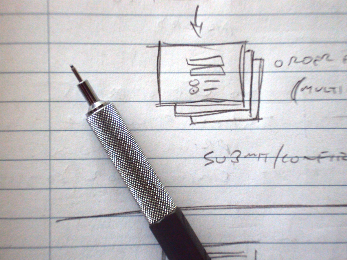
A pencil is simple, highly portable, reliable, and works well for a number of tasks. My main pencils are mechanical ones that takes .5mm leads. I’ve found that .3mm leads are too thin for my often-heavy hand and easily break. I also have a pencil that uses .7mm leads, but I don’t use it as much.

The primary, though not sole, design task that the pencil supports occurs early in the design process. Ideation involves a lot of generation, exploration, and development of ideas. The pencil is the tool that enables me to capture my visual thinking quickly. Whether used to create tiny thumbnail pictures of a screen’s overall layout, or for capturing more details on a form design, a pencil enables me to get the job done quickly. The drawings are often pretty rudimentary and ugly, but that’s fine for capturing my visual thinking for my own use. For sharing ideas I usually render the visuals in a more refined way.

A companion tool much of the time, particularly when at work, is a 7.5 inch by 9 inch notebook. Sometimes, though, I’ll switch to a larger pad of grid paper. When I’m away from the office or home, I use a smaller Moleskine notebook, which has a lovely tactile quality as well as paper that takes pencil marks quite well. Really, though, any small notebook would do.

In addition to my mechanical pencil, I also use wood-cased coloured pencils for various reasons and at various design stages. They’re a little messier, as they need periodic sharpening and the leads are more prone to breaking, but I like them. I’ll use colours to lightly shade areas in a pencil sketch to help me easily pick out major features at a glance, or use a heavier coloured line to call attention to a particular feature.

As an aside, one of my favourite books is The Pencil, by Henry Petroski. It’s a great read that explores the nature of engineering and product development via an engrossing story of the history of the pencil.