Duelling “Cancel” buttons on my iPhone

I’ve recently noticed an example of duelling “Cancel” buttons in iOS 8 on my iPhone. Have a look the following screen captures to see how it plays out.

Screen 1 shows the Photos app on my iPhone, showing a photo of a steam locomotive. If I want to make some changes to the photo, I can tap the “Edit” button in the upper right corner to edit the photo.

Screen image: train

(Screen 1)

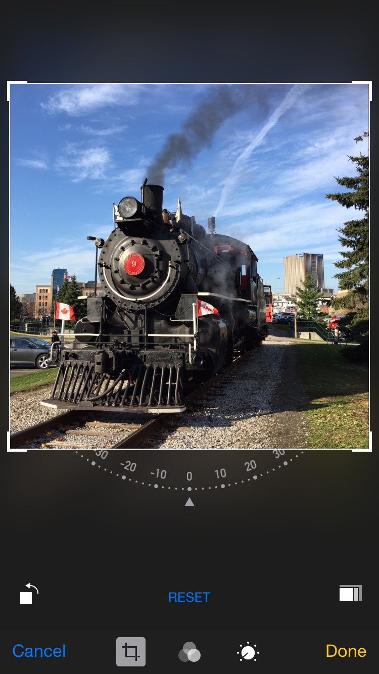
In Screen 2, I’ve decided to crop the image, which is easy to do.

Photo-editing screen on an iPhone

(Screen 2)

Maybe this photo doesn’t need to be cropped after all. In Screen 3 I can tap “Cancel” in the bottom left corner.

Photo-editing screen on an iPhone

(Screen 3)

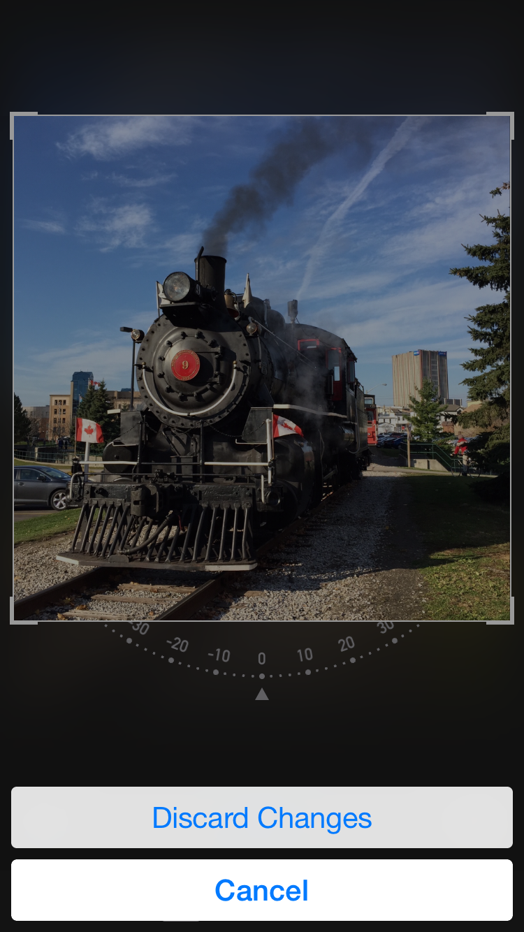
The App designers don’t want me to inadvertently lose any work that I’ve done. In Screen 4 the app presents a confirmation, with “Discard Changes” and “Cancel” as the options. Why yes! I do want to cancel!

Photo-editing screen on an iPhone

(Screen 4)

Of course, the meaning “Cancel” has changed! Initially it meant “I don’t want to make these changes!”. Now it means “I do want to make these changes!” which is obviously a little confusing, as tapping cancel will leave me on the same editing screen that I actually want to leave.

A better pair of labels might be “Cancel, and discard changes” and “Continue editing”. There are probably plenty of others.

You don’t often see this kind of unclearly worded confirmation these days!

Airplane routes and chartjunk

While traveling home from UX Camp Ottawa, Bob Barlow-Busch and I had a fun discussion about our airplane’s route as presented to us by the seat-back, enRoute system. The system cycles through multiple screens showing information about our trip in progress.

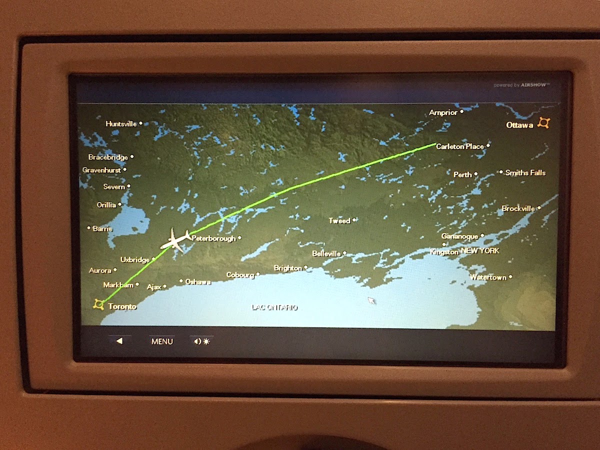
Here’s a photo of a route map, showing us flying west from Ottawa to Toronto. The airplane icon moves from right to left over the course of the trip. The map is presented at a variety of other scales as well. (As an aside, a segment of the route trace is missing at the start.)

Flight path map on an airplane seat back

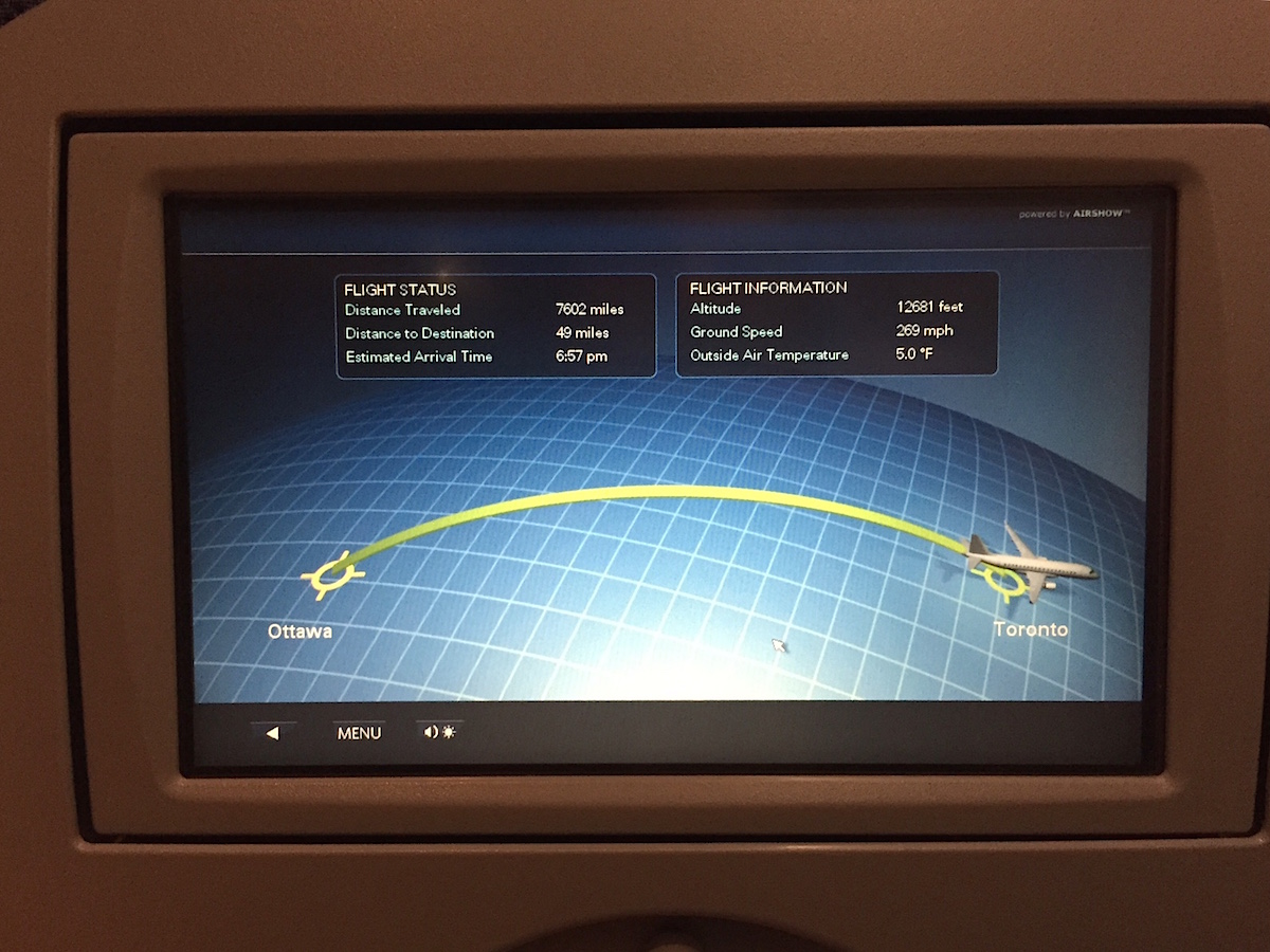
Here’s a photo of what looks like a simplified route map. The airplane icon moves from left to right over the course of the trip. That’s the opposite direction to what is shown in the earlier map.

Flight path map on an airplane seat back

What’s going on is that the second map is really a progress indicator that has been “enhanced” through the addition of a curved grid and the use of a curved progress line. These enhancements seem to be meant to evoke a 3-dimensional route through the air. The problem is that when shown right after the previous map, the direction of travel is reversed for our particular trip. The system has a generalized approach to representing any given trip, and in the case of ours this conflicting presentation is the result.

A simple solution would be to create a progress indicator that is devoid of what Edward Tufte calls chartjunk. A clearer presentation would be unlikely to look like a flight trace.

Isn’t that fun?

As an aside, Bob and I were quite aware that we were flying through the air at high speed on a regularly scheduled flight, and that give that context this was a pretty minor issue for us!

Designing and building at Boltmade

Logo: Boltmade

It’s been a while since I wrote a post for this blog (though I do post at Fluxible and uxWaterloo), but there are a few things happening that warrant posts here. For now, I’ll mention that I’ve joined Boltmade, a terrific software product design and development shop here in Waterloo. I’ve known Jim Murphy and some of the other folks at Boltmade for several years, and I’m delighted to be working with them to create great software for our clients. It’s a wonderful group of people, and I love what Boltmade is doing.

I enjoyed four years of designing and building heathcare products with the team at Karos Health, and will miss the daily opportunity to work with them. On the other hand, they’re just a short walk away from Boltmade, and I know that lunches and beers after work will remain a staple of those relationships!

Fluxible is almost here and you should register if you haven’t

Logo: Fluxible - A User Experience Event

The last few months have been busy on a number of fronts, but the one I that want to mention now is Fluxible. Fluxible, as I have written previously, is a user experience conference that I started with Bob Barlow-Busch and that he and I have been organizing along with a team of dedicated and enthusiastic volunteers.

The work is all coming together as we enter the last few days of preparation in anticipation of our morning start on Saturday September 22 at the Conrad Centre in downtown Kitchener. The program that we ended up with is far more ambitious than we had initially envisioned, in part because so many amazing speakers were willing to join us, and in part because we lined of some very supportive sponsors. This is going to be a great event, with talks, workshops, and the chance to meet and learn from all kinds of amazing people. And we still have a few more surprises in store for everyone, which is saying something when you consider that we unveiled a theme song last month!

If you haven’t registered yet, there’s still time to do so. If you register now using the uxWaterloo promotional code, you’ll receive a $200 discount over the regular rate. It’s a fantastic deal for a weekend that looks like it will be an exceptional experience.

How we found venues for Fluxible

I wrote previously about how Bob Barlow-Busch and I approached finding speakers for Fluxible. Here’s a little bit of what went into finding our venues.

At the same time we were looking for speakers, we were also trying to figure out where Fluxible would be held. Obviously, decisions about venues were influenced by our program. But the reverse was also true, in that the venues we looked at affected our thinking about the program.

Going into this, we knew that we wanted to have talks. We knew that we wanted to have hands-on workshops. And we knew that we wanted a big party where everyone could socialize and have fun. As we looked at potential venues, our thinking clarified and we began to get specific ideas about what each of the spaces could offer.

In addition to what we wanted to use spaces for, there were a few constraints that we needed to keep in mind. These included:

  • a target date of Fall 2012
  • avoiding other major events that would be of interest to our audience
  • accommodating around 200 people
  • finding inspiring and energizing spaces that we’d enjoy spending time in
  • venue availability
  • access to parking, public transit, and restaurants
  • technical infrastructure to support our needs.

I had some experience with suitable venues in the region, from my years of helping to organize Ignite Waterloo. In fact, Ignite Waterloo had previously held events at two of the venues we eventually selected for Fluxible: the Conrad Centre for the Performing Arts and the Communitech Hub. We wanted to be thorough, though, so we made sure to visit many other candidate venues as well.

In the end, after balancing our very real needs and constraints, we came up with a set of venues that worked out very well and that showcase some terrific buildings in downtown Kitchener. The Conrad Centre, where Saturday’s talks will be presented, is an amazing performance space that will put the focus on our speakers and their talks. Kitchener City Hall has some beautiful interior spaces that we’ll take full advantage of for a Saturday evening party. Finally, the Communitech Hub has been a big success story over the last couple of years, and will make for a delightful host for our workshops and closing party on Sunday.

As with our experience approaching speakers, the people who run these venues have been enthusiastically supportive of our event. They’ve made suggestions on how to get the most out of these spaces, and have pointed out a few surprising things that hadn’t even occurred to us. For example, we’ll have use of the beautiful council chamber at Kitchener City Hall!

We’re confident that Fluxible has found several good homes for 2012, and we’re looking forward to seeing everyone there.

Note: A sightly different version of this post originally appeared over at Fluxible. Thanks to Bob Barlow-Busch for the helpful edits.


How to find speakers for a conference

As some of you may know, I’m co-chair of Fluxible, a user experience event that’s coming to Waterloo Region in September. I thought it might be interesting to share some of the thinking and activities that go into organizing an event like this. For today, let’s start with the process of finding people to speak and lead workshops.

My co-chair Bob Barlow-Busch and I had some pretty simple criteria in our early stages of thinking about the event: we wanted to have fun; we wanted to learn something; we wanted to meet interesting people.

We had the good sense to ask for advice from Daniel Szuc, a supremely interesting person whom Bob has known for about 10 years. Daniel was generous with his time and thoughts, and shared some excellent advice based on his experiences running UX Hong Kong. That was an important and inspiring conversation for us.

We still weren’t certain what level of interest to expect from potential speakers, since Fluxible is a brand new event. But we had a few ideas and made some enquiries. Almost immediately, we discovered that interest was very strong. When I invited my former colleague James Wu, he accepted right away. Similarly, Bob’s former colleague Patrick Hofmann jumped right on board as well.

We were off to a great start. We thought about the kinds of things we wanted to learn and about our favorite speakers from other conferences, then started asking around more widely. At the same time, people started approaching us as word got around, and our newly-formed volunteer team brought some great suggestions to the table as well. Most of the potential speakers we invited agreed to participate, aside from a small number who were unable due to prior commitments. But everyone was encouraging and offered assistance of some sort. Pretty soon we realized that we’d gotten caught up in our own enthusiasm — and that we had more people on board than we had originally planned!

Admittedly, however, that was a delightful problem to solve.

As things stand now, we’ve announced eight speakers on Saturday, eight workshop offerings to choose from on Sunday, and a closing keynote speaker. We have designers, developers, and researchers from academia and industry, from global companies and from cutting edge boutique consultancies. These generous experts are delivering hands-on workshops, visionary talks, and plenty of inspiring moments in between.

And even with all that, there’s one final announcement still to come!

We’re thrilled with the program we’ve put together, as it’s an extraordinary group. We hope you agree.

Note: A sightly different version of this post originally appeared over at Fluxible. Thanks to Bob Barlow-Busch for the helpful edits.
Cooking with an iPad

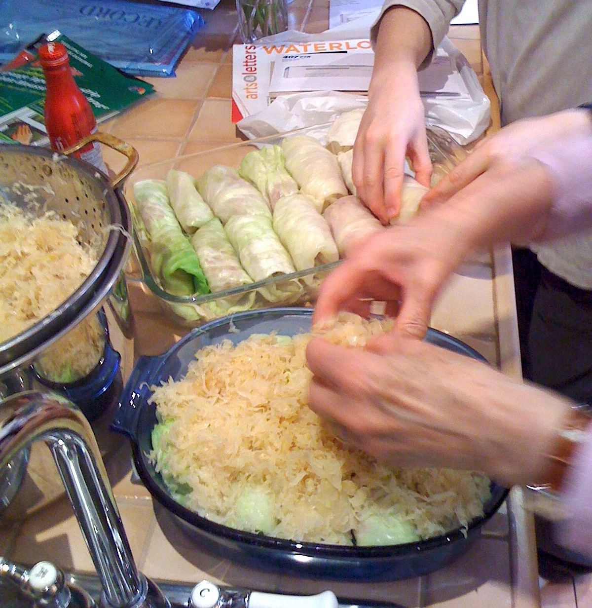
A closeup of two pairs of hands preparing cabbage roles for cooking

Some time ago ago, my friend Linda asked me to share a recipe for cabbage rolls that I had been taught by my mum.

I decided that I’d try documenting the recipe using Pages on my iPad. I had previously created a few simple documents in Pages, and wanted to explore it some more.

I first confirmed the details for the recipe with my mum, making a few notes during a phone call with her. Next, I documented her secret recipe in Pages on iPad, discovering in the process that Pages includes some easy-to-use and reasonable-looking templates. The recipe was easy to create, and because the template included a photo, I added one that I had taken the during and earlier cooking session when I had made the recipe with my mum and son. The result was quite pleasing, and had taken only a few minutes to create.

I next decided to try the documented recipe before sending it to my friend. My son and I made a batch of cabbage rolls one weekend, and this is where the story took a fun turn. While cooking we did a video call with my mum on the iPad. The surprisingly engaging part was using the rear-facing camera on the iPad to document the creation of the meal live for my mum during the call. The mobility of the iPad made it easy to show our progress, with my son and I periodically swapping roles as cook and videographer. The immediacy of the experience made it feel like the three of us were working on the meal together.

I sent a PDF of the proven recipe to Linda, who later reported that she successfully made and enjoyed a batch of cabbage rolls.

Nothing novel here, but I was still struck by how easy, empowering, and downright fun the whole process was, and by what an amazing product the iPad is.

uxWaterloo design workshop with REEP

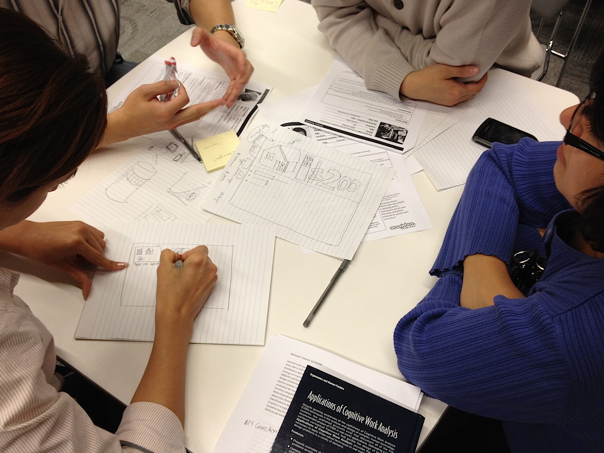
People sketching potential solutions for REEP at uxWaterloo event

Last Thursday the uxWaterloo meeting for October featured a new kind of activity. While we had done design workshops in the past, we had never previously had a design workshop focused on a real-world problem.

REEP Green Solutions, a Waterloo Region not-for-profit organization focused on the environment, is working on a web application that’s intended to help consumers understand the case for making upgrades to their homes that will increase energy efficiency. REEP approached uxWaterloo for help, and Thursday’s design workshop was the result.

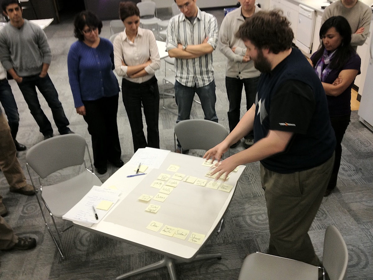
People surrounding a table covered with sticky notes

Working in small groups, workshop attendees brainstormed initial designs to deliver a compelling user experience for the application. REEP team members provided input, answered questions, and otherwise provided context for the design work. They had previously provided personas to work from, and a high-level functional description of their vision.

While the timeframe was ridiculously condensed — the meeting was only 90 minutes from start to finish — the workshop was a great success. Everyone seemed to have a great time, with many interesting ideas emerging from the action. The REEP team was excited by the ideas they saw and heard, and are already thinking about next steps.

Steve Jobs

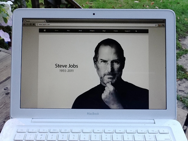
Apples Steve Jobs memorial page on a Macbook

I’m surprisingly saddened by the passing of Apple’s Steve Jobs, a man I never met. I’m also feeling surprisingly reflective. I can’t think of any other company or person whose products have had such a profound impact on my daily life for such a long time.

The Mac wasn’t the first computer that I ever used, but my first Mac made a liberating, empowering, and lasting impression on me. I don’t think it’s any exaggeration to say that I would not be doing what I’m doing in my career as a designer without the Mac and later products from Apple.

I think that my best response today is to use my Mac to try to make the world a better place. I hope that I can have even a fraction of the impact that Jobs had.

It feels overwhelmingly fitting to finish off this short post by saying that I wrote it on my iPad.

Some Apple products are imperfect by design

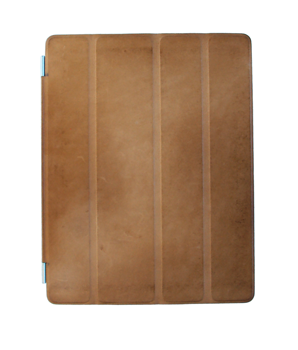
An iPad cover with some patina

I’ve been using an Apple iPad 2 for a few months now, and have enjoyed it tremendously. One aspect of it that stands out is the deliberate imperfection that Apple has introduced into the design of the Smart Cover accessory. I’d go as far as to say that Apple has embraced Wabi Sabi, the Japanese aesthetic which accepts, and even demands, imperfection and transience as an important aspect of beauty.

The Smart Cover that I have on my iPad is leather. Out of the box, it wasn’t quite pristine, but had a lovely texture. In the last several months, though, it has acquired an uneven patina through daily use, along with more noticeable scuffs and marks. It’s no longer perfect, if it ever was, and it now provides a striking contrast to the aluminum and glass ‘perfection’ of the iPad. It completes the iPad, providing a visual warmth and a organic feel that the cover-less iPad lacks.

The unique imperfections have marked the iPad as ‘mine’ — distinct from an iPad that someone else might own — as effectively as the combination of apps, books, music, games, and other bits of data that I’ve installed/assembled/created on it.

Apple is, of course, aware of the inevitability of these ‘imperfections’. The packaging for the smart cover includes a notice: “The leather Smart Cover is crafted from high-quality, naturally treated material that gets its color from a rich aniline dye. Some color may rub off during use.” (Emphasis mine.)

Beautifully done.